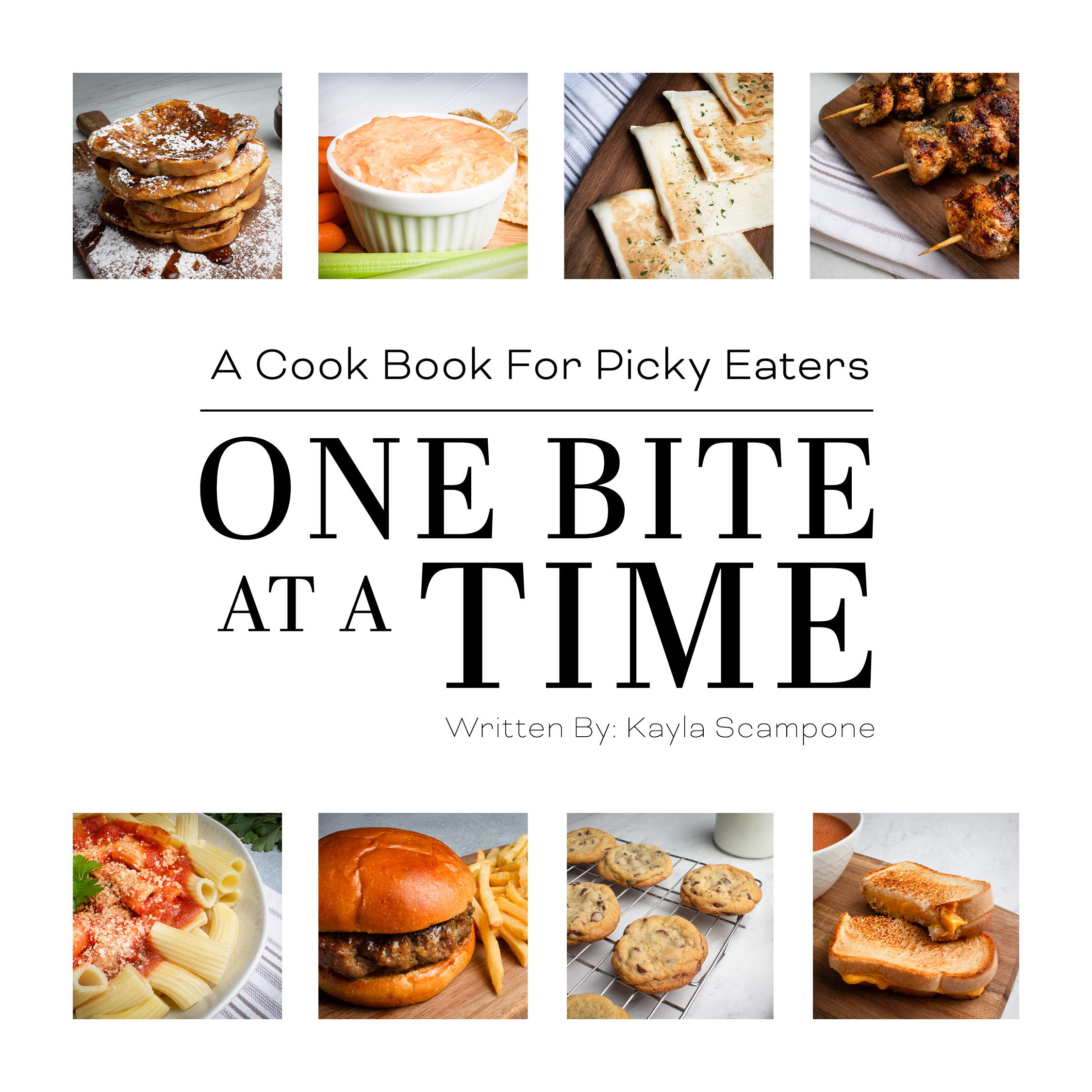
One Bite At A Time
Project Overview
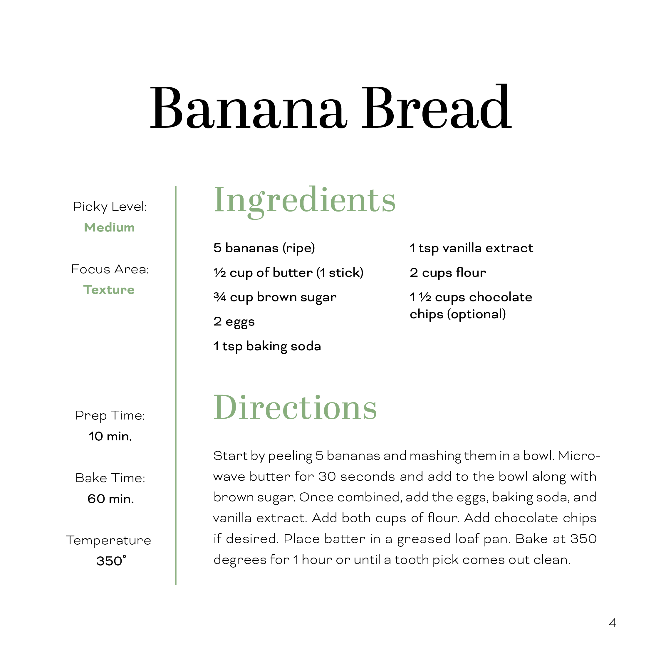
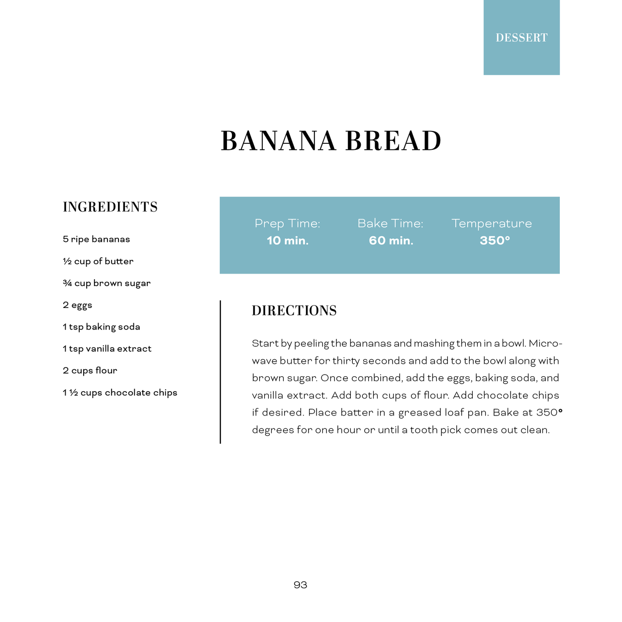
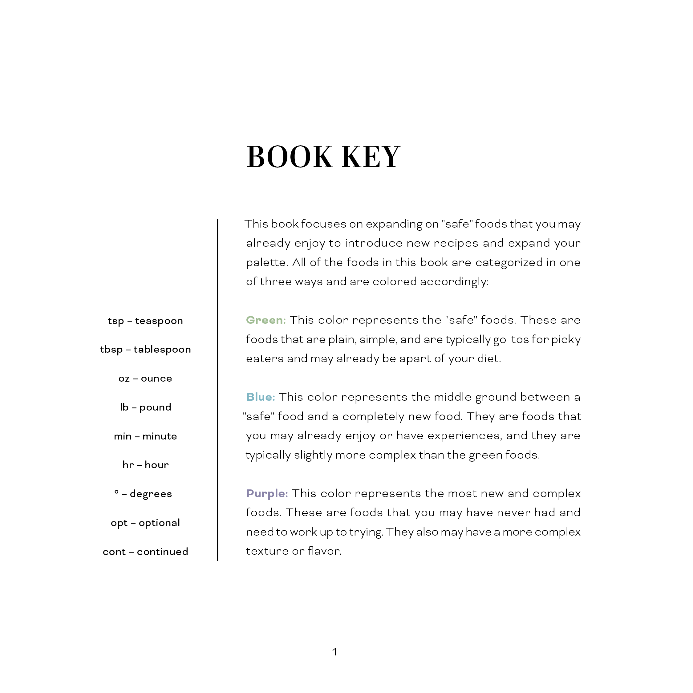
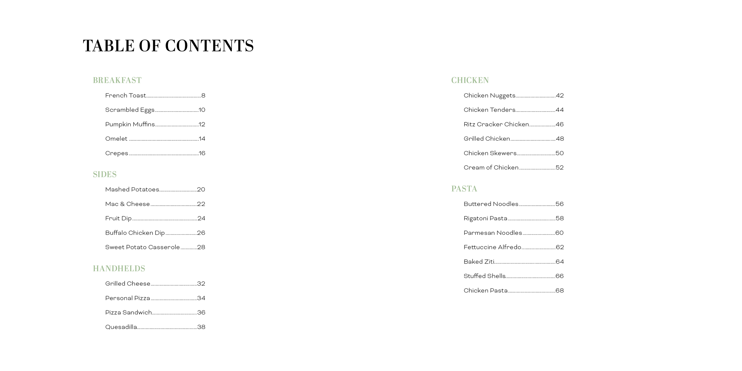
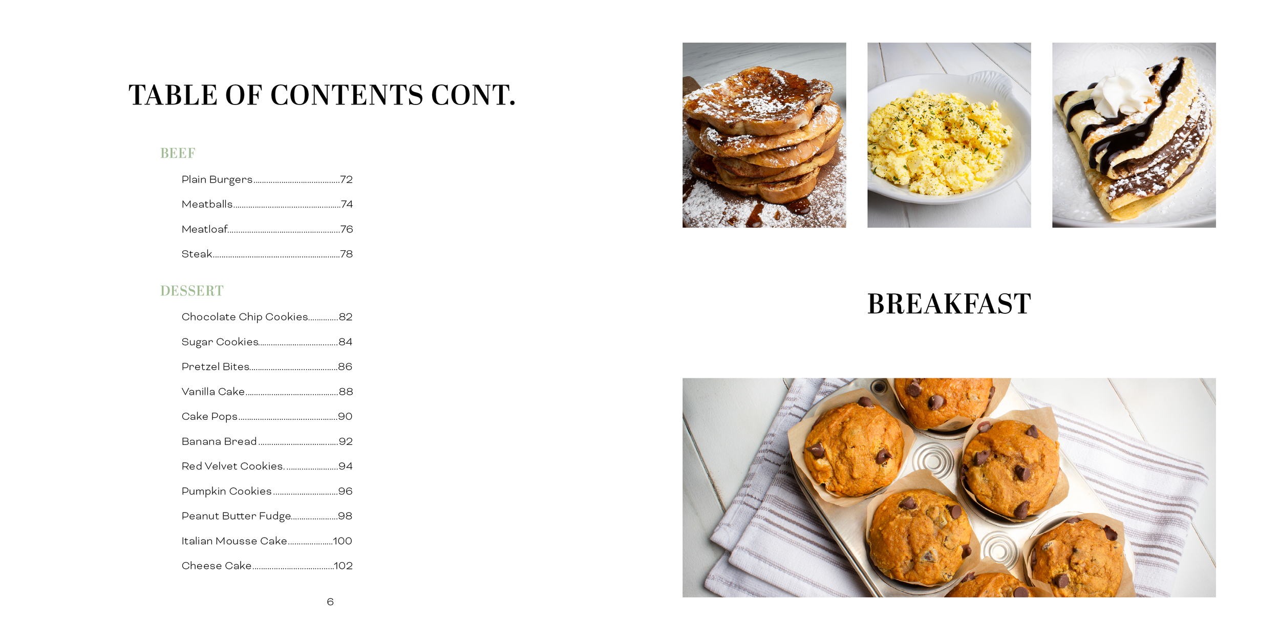
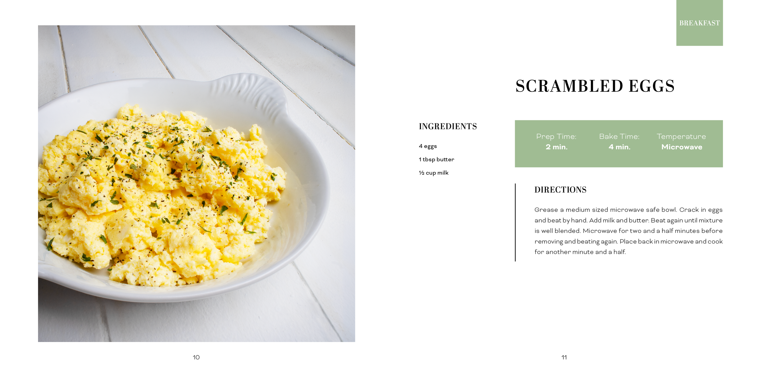
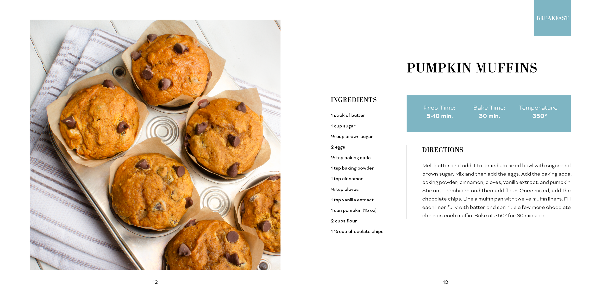
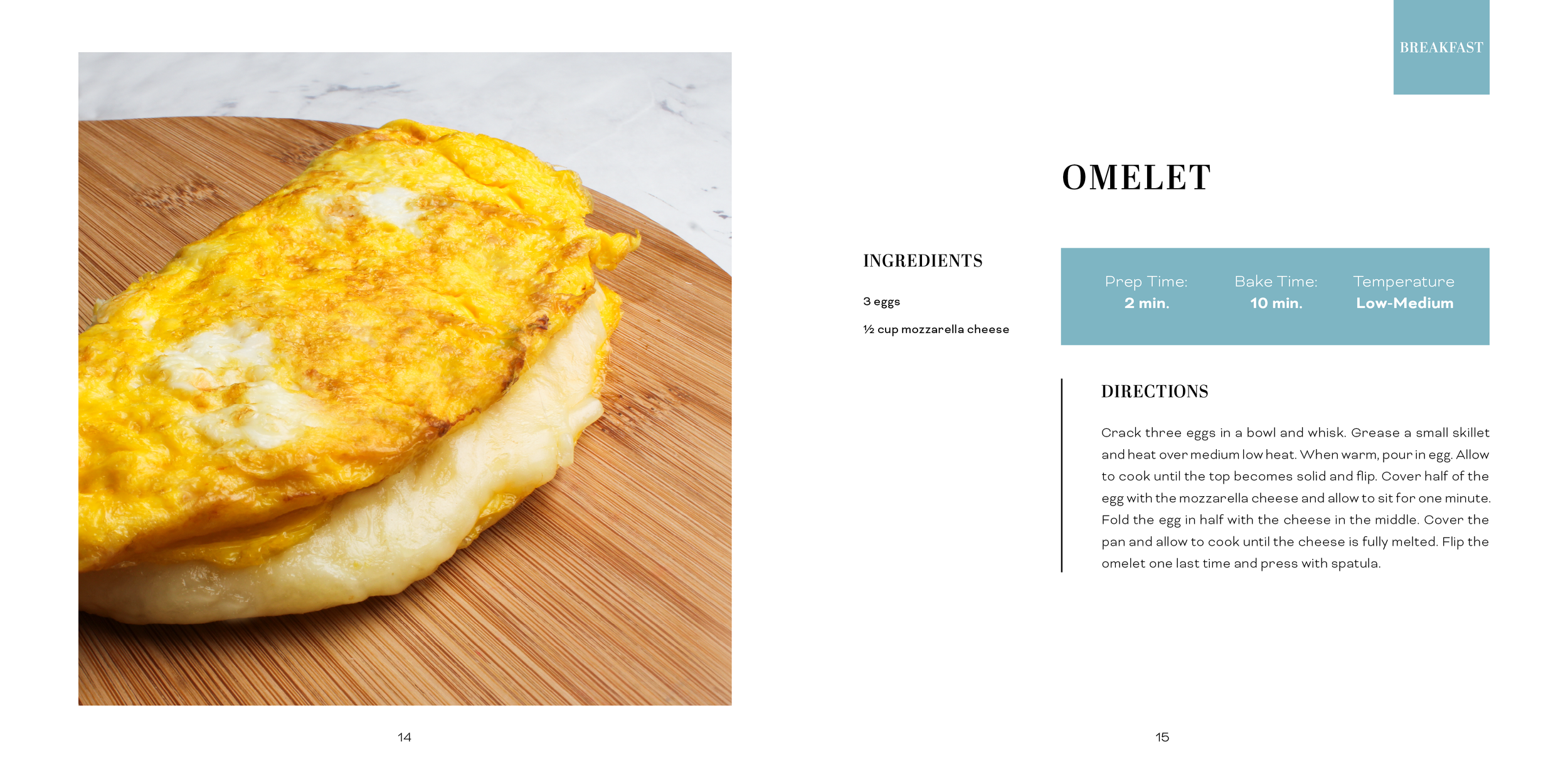
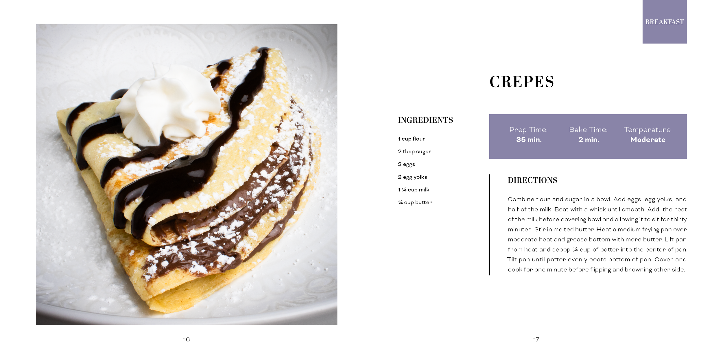
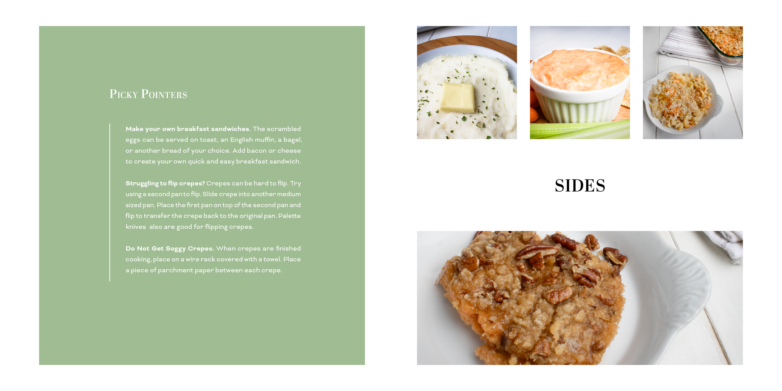
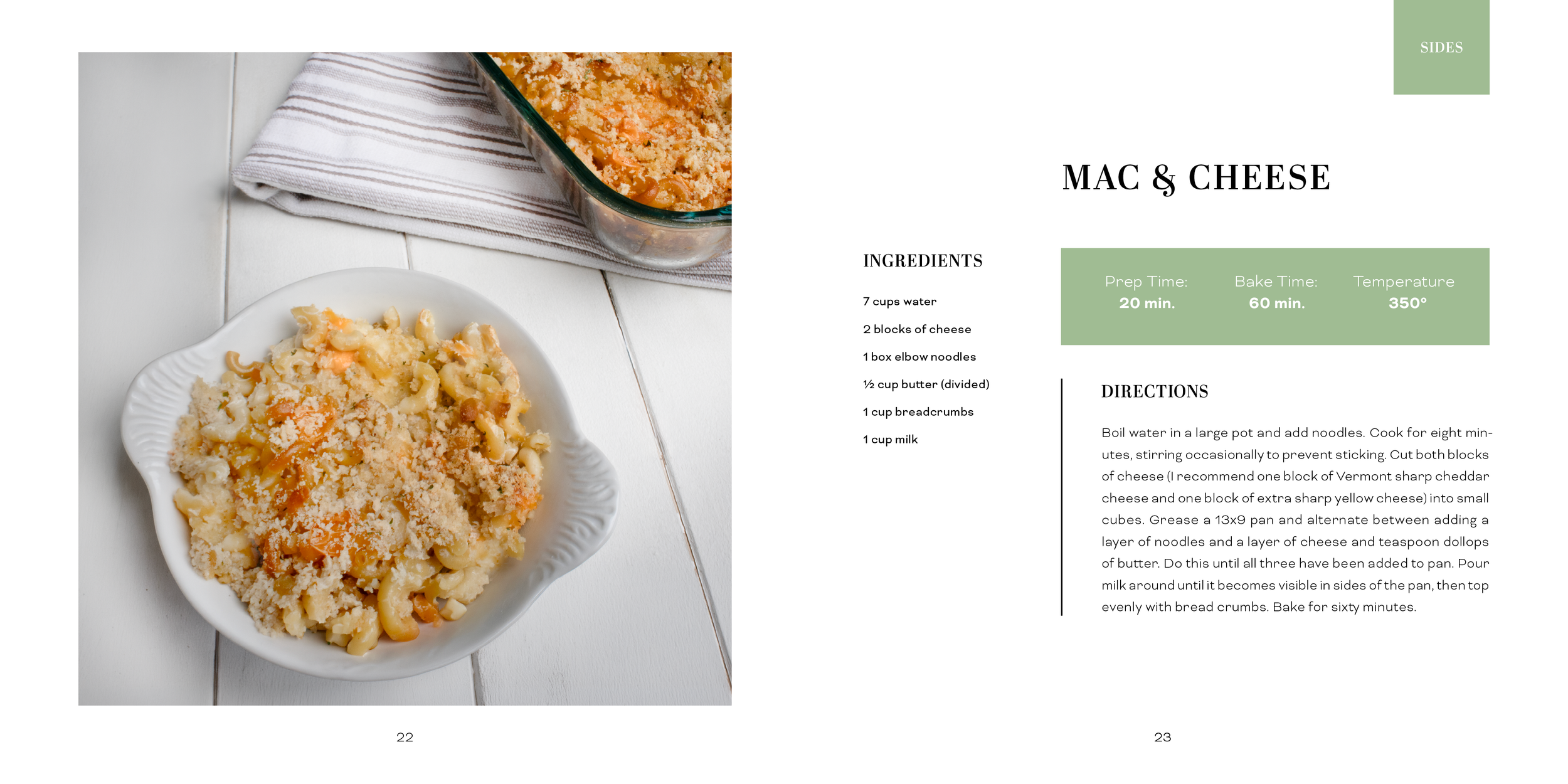
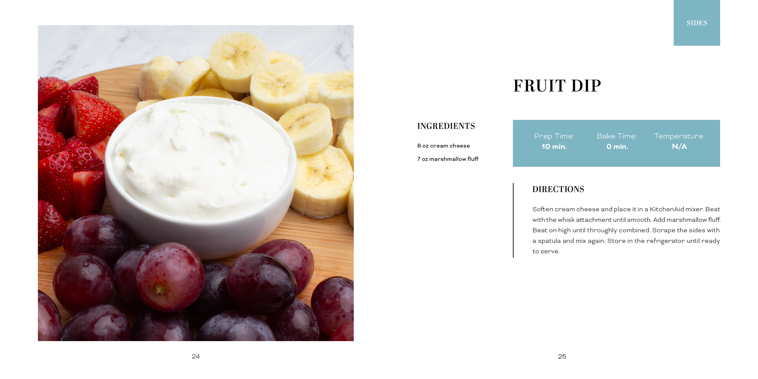
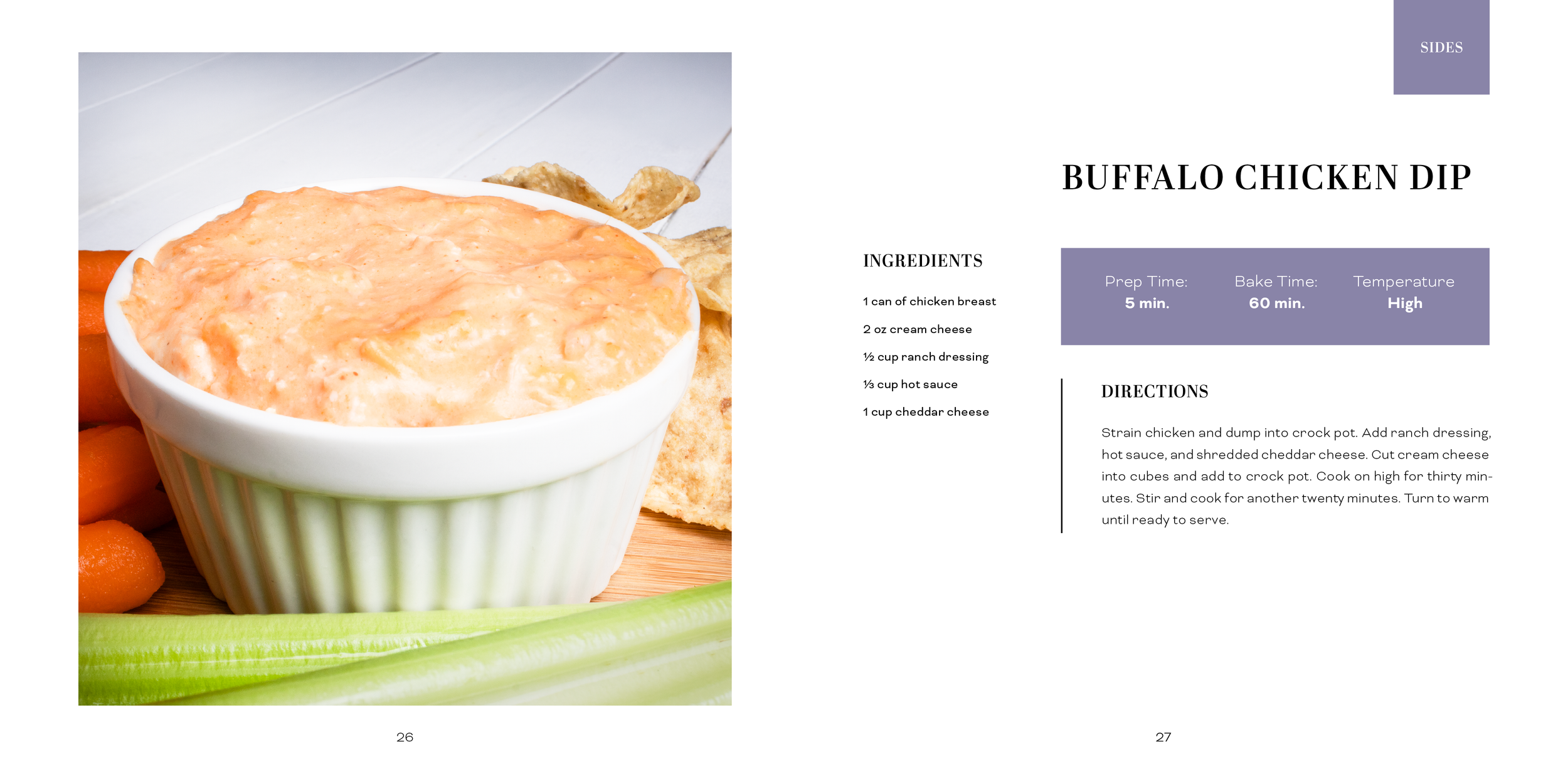
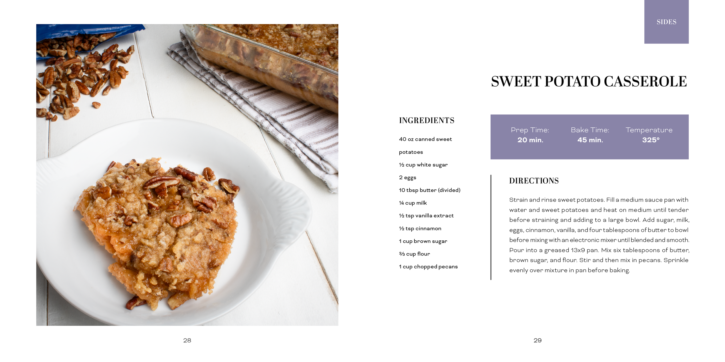
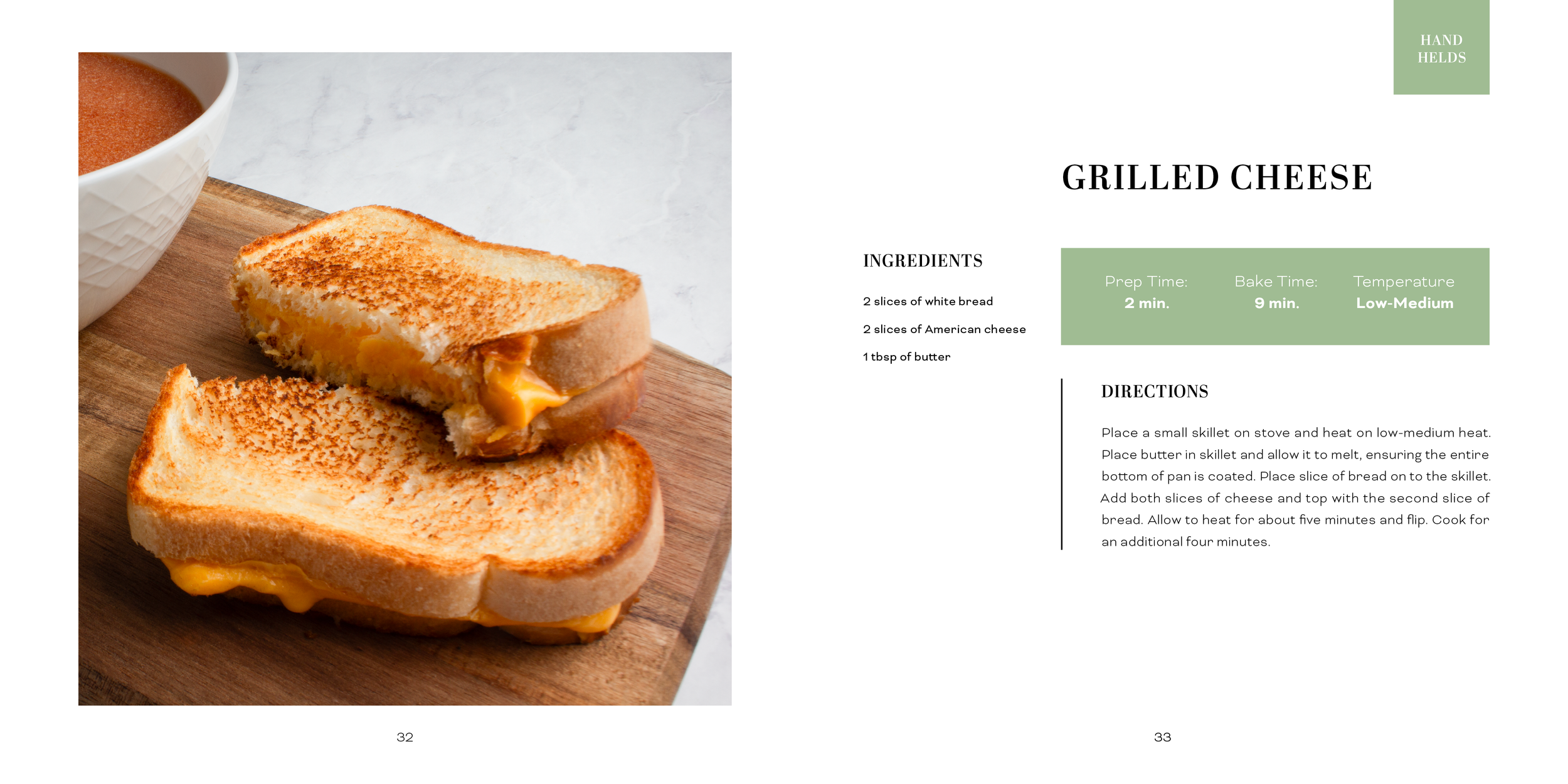
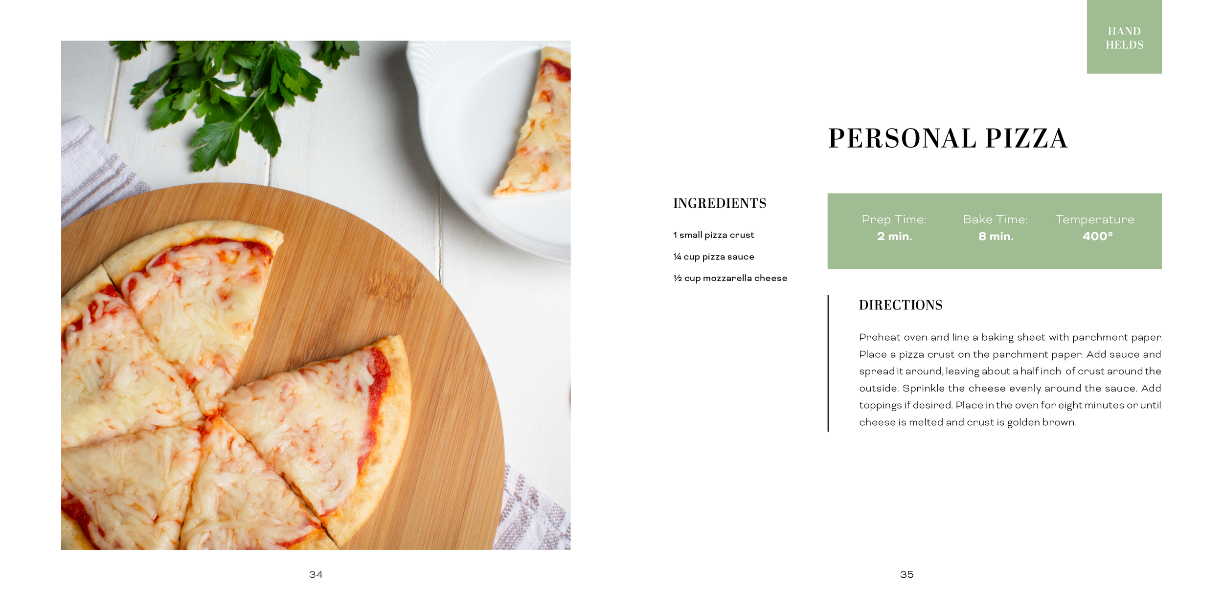
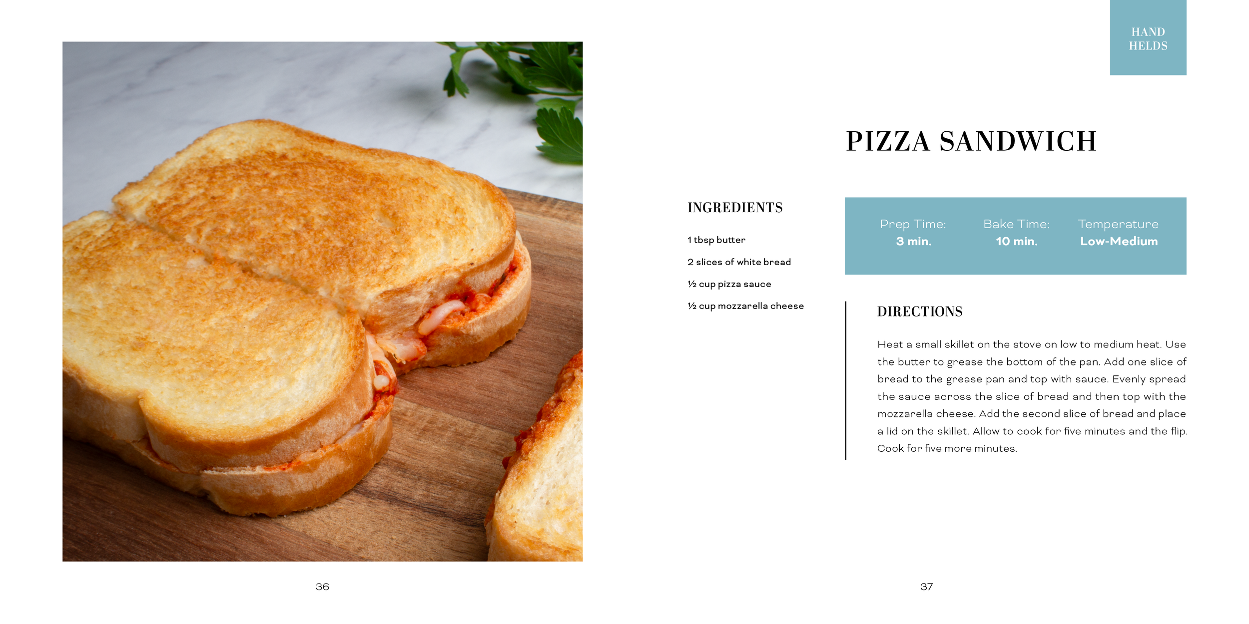
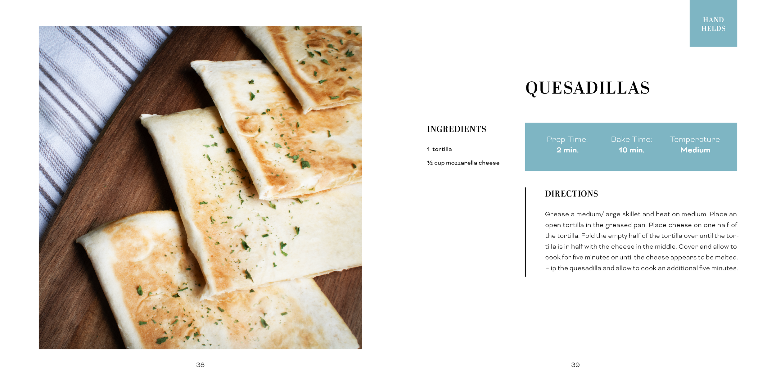
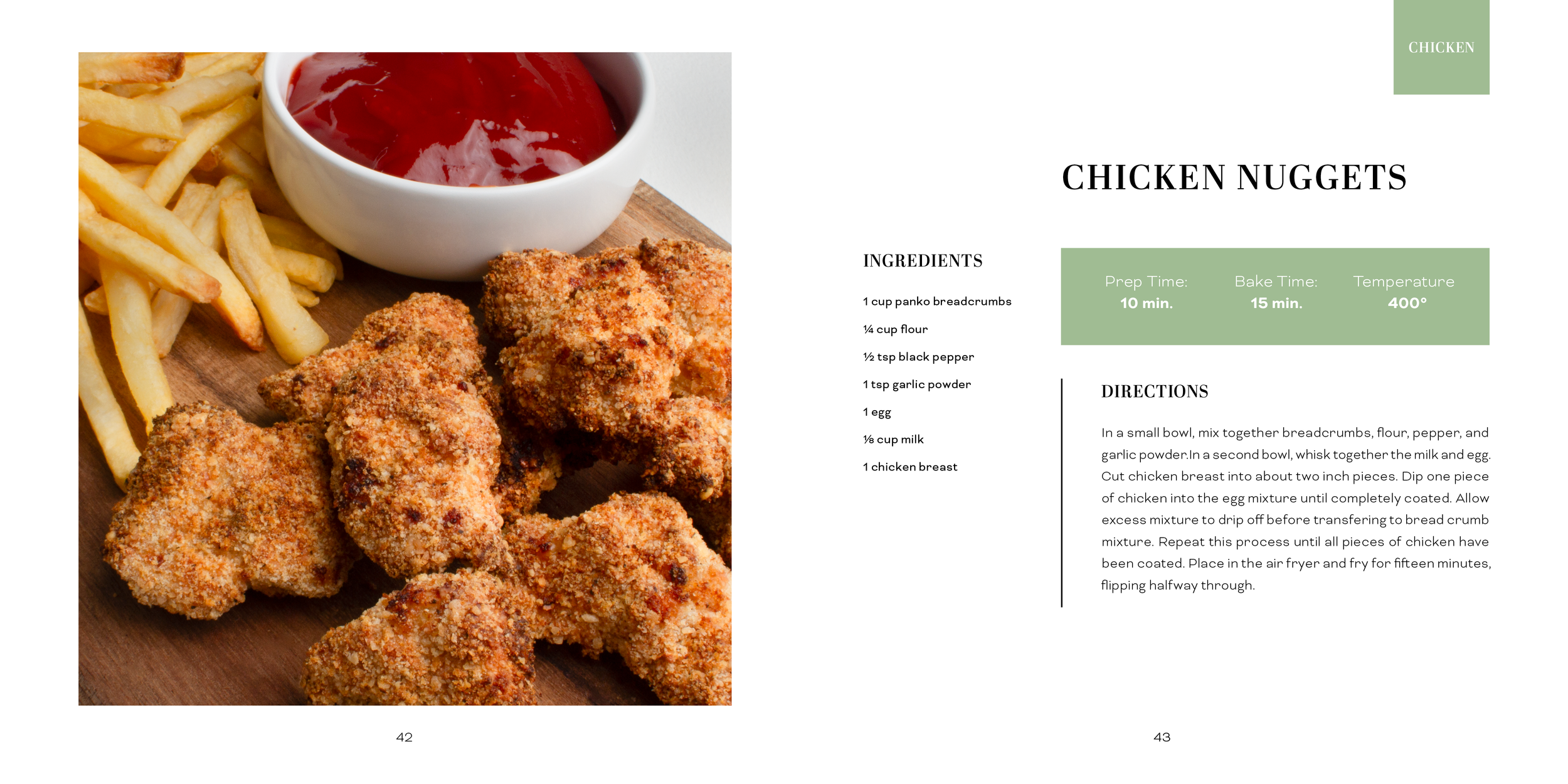
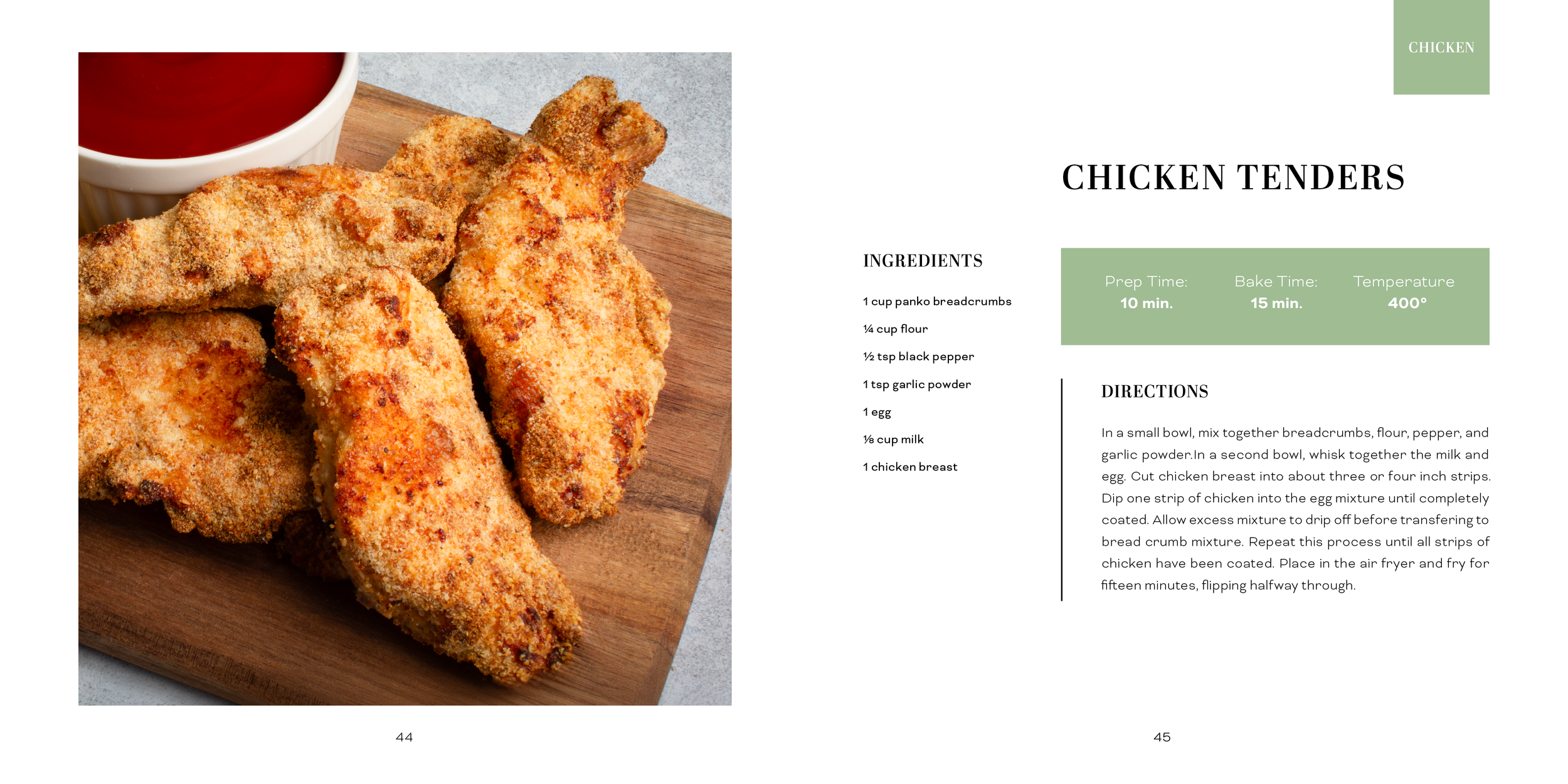
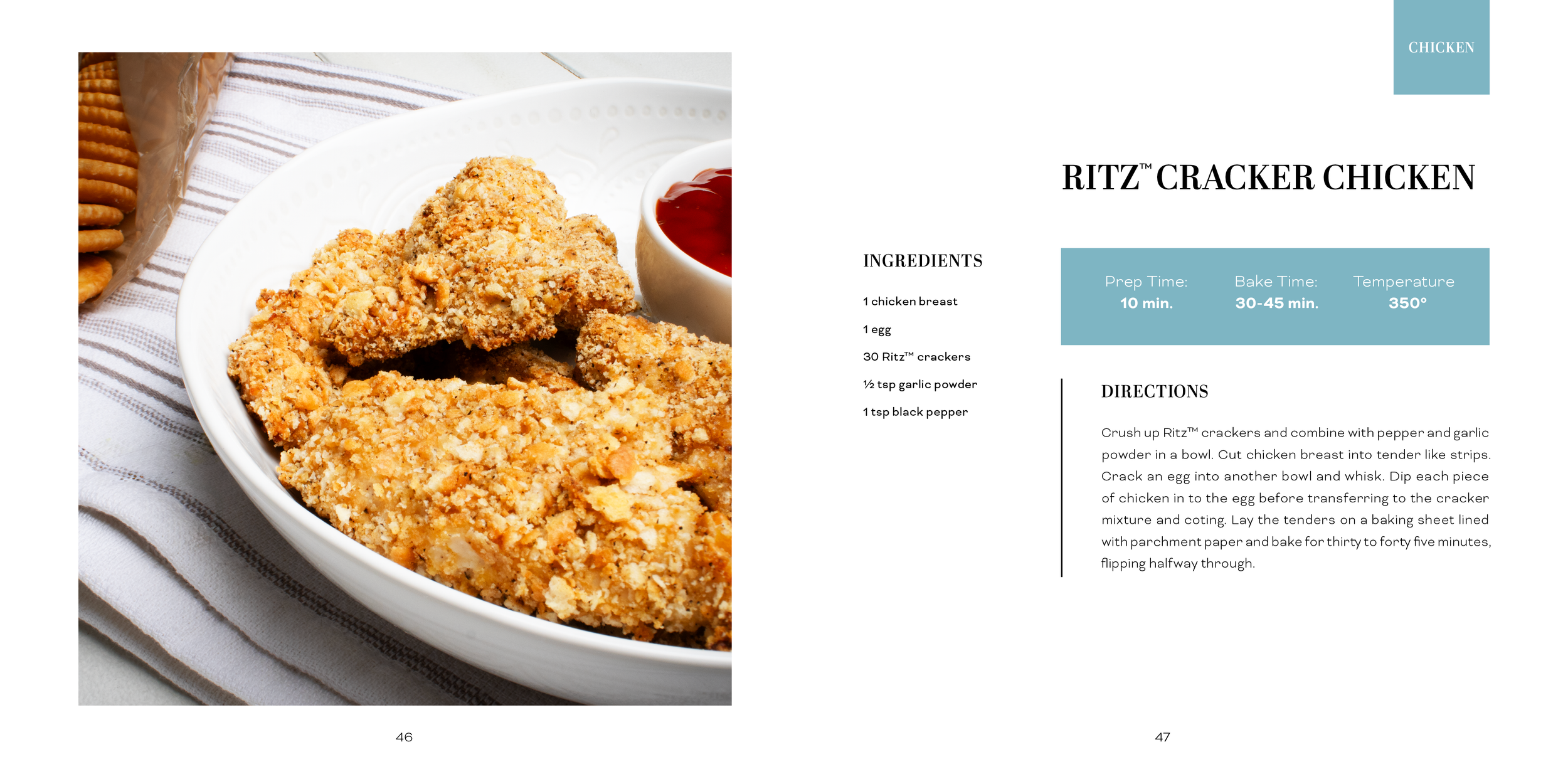
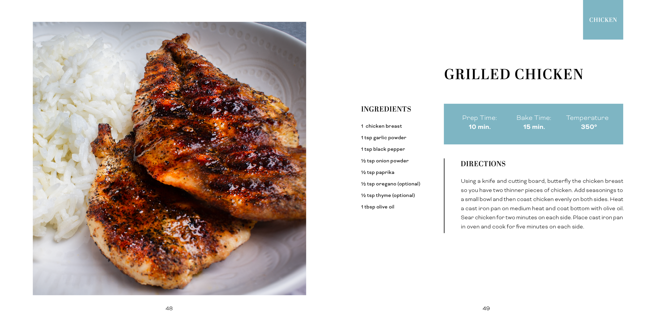
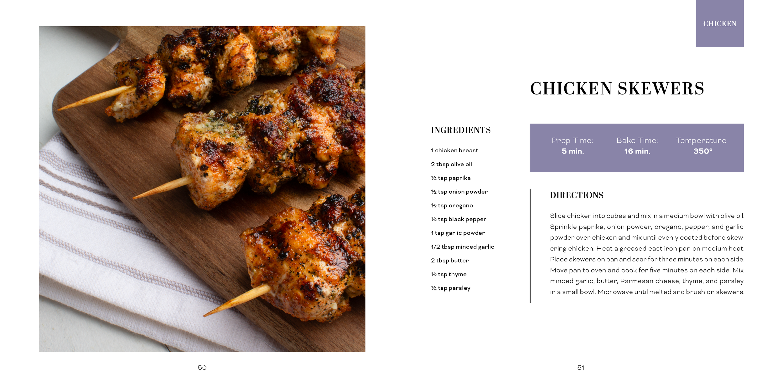
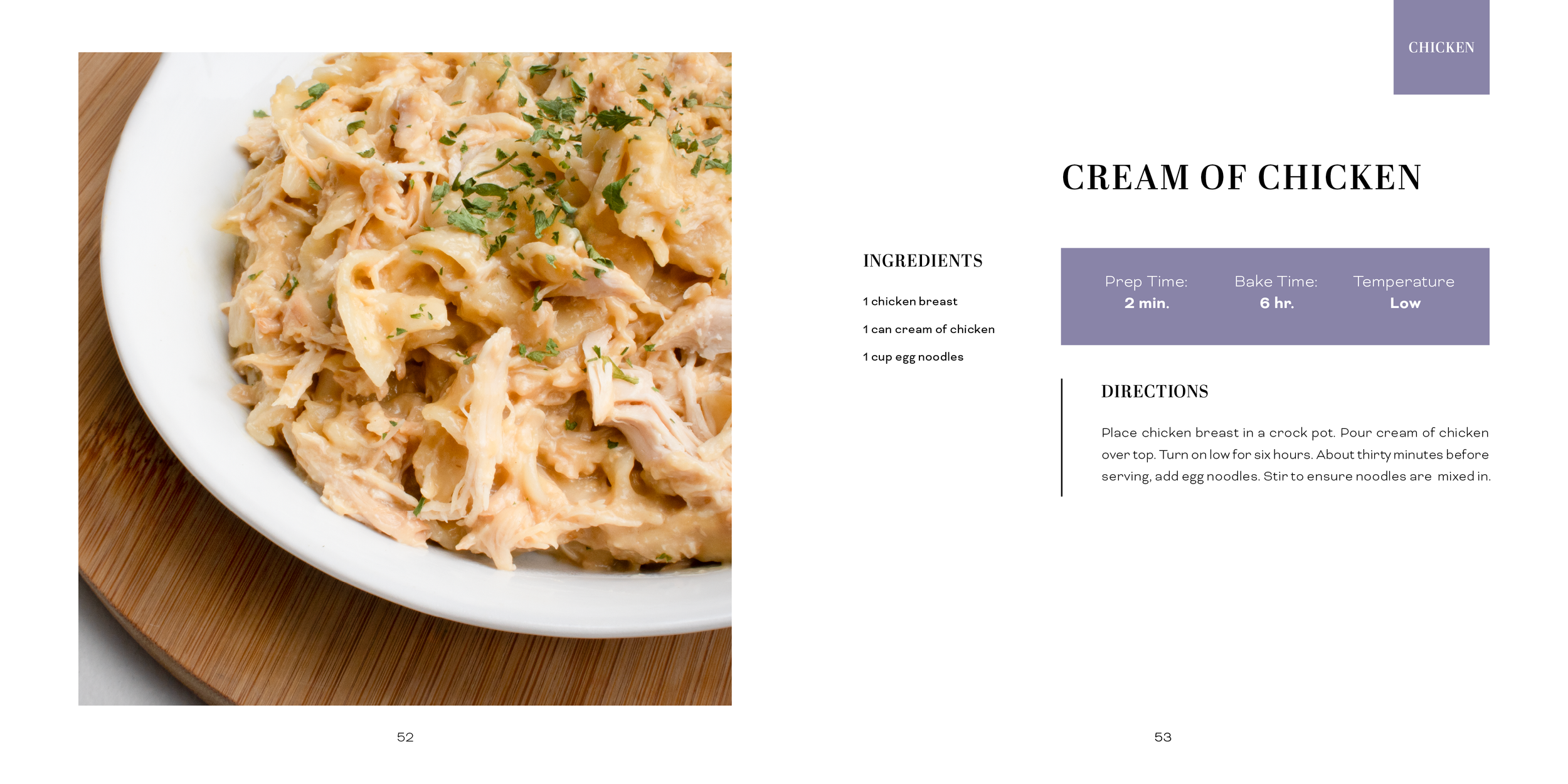
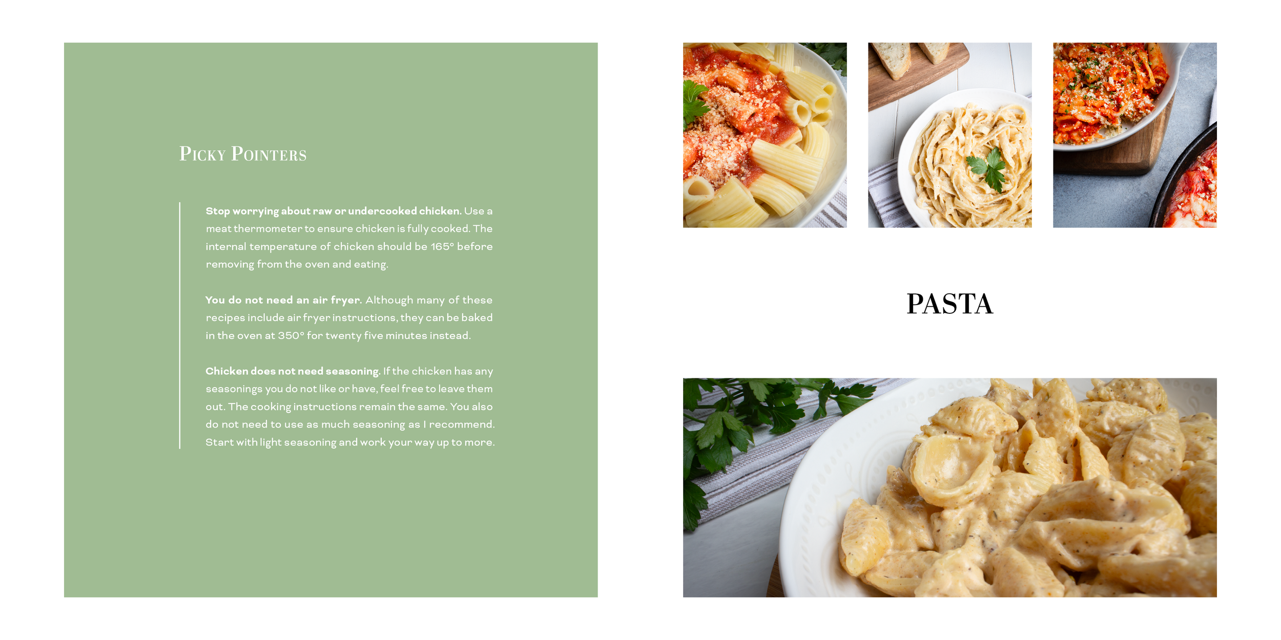
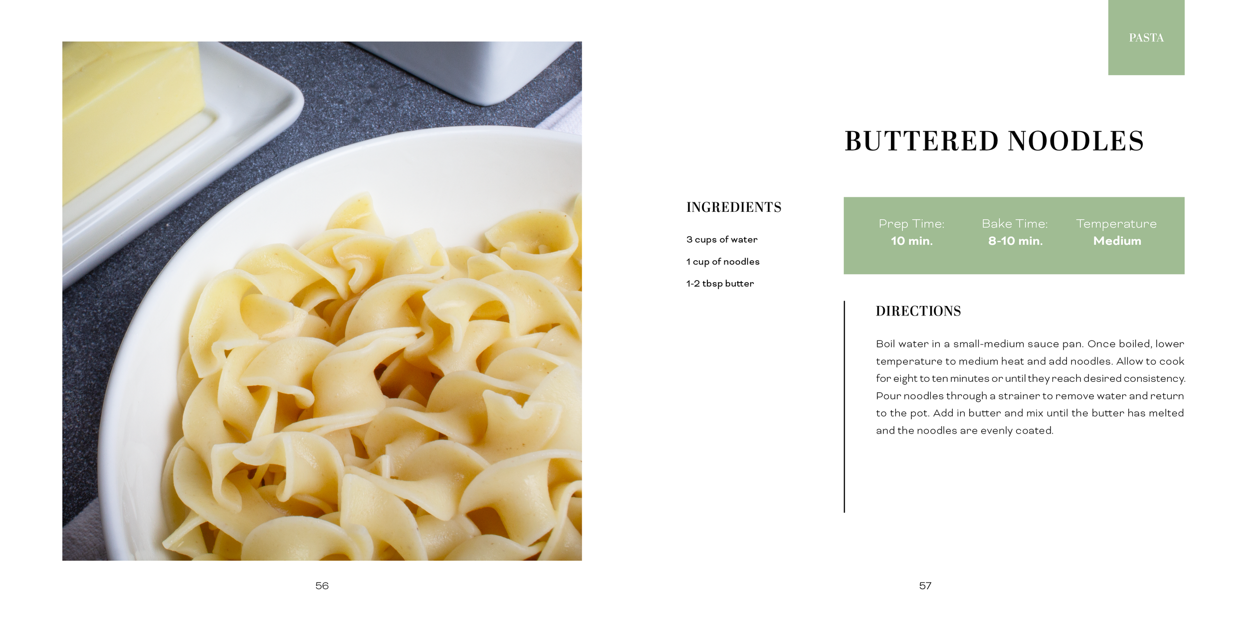
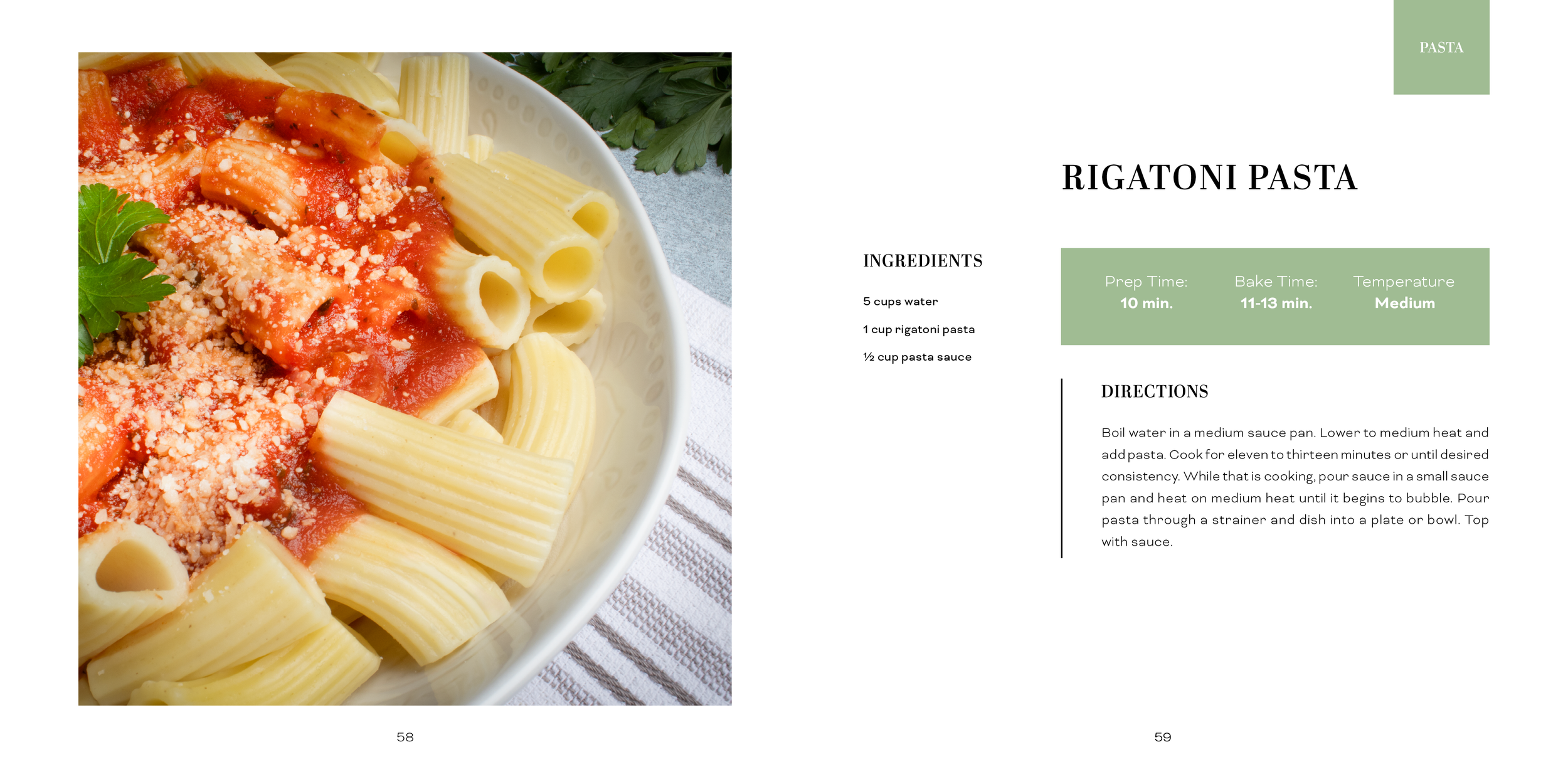
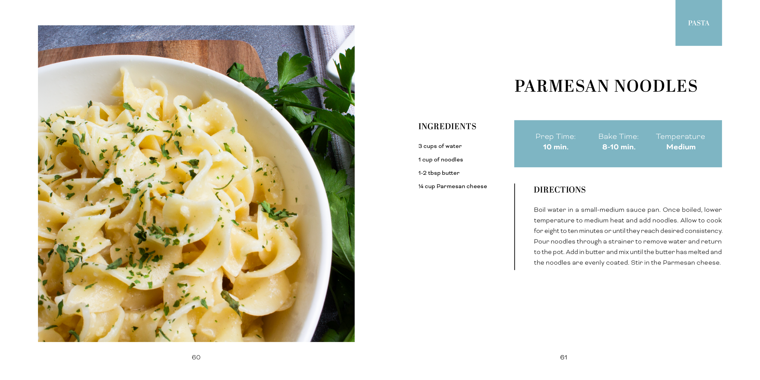
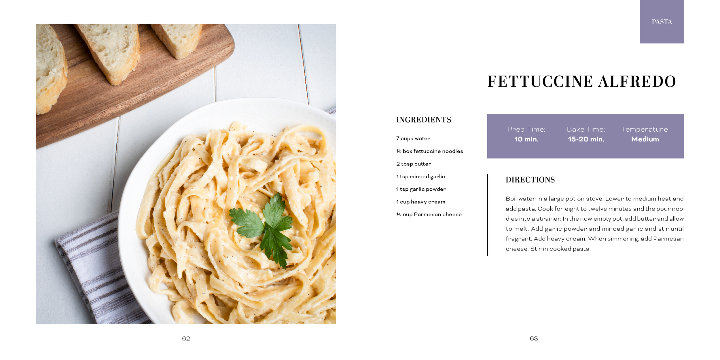
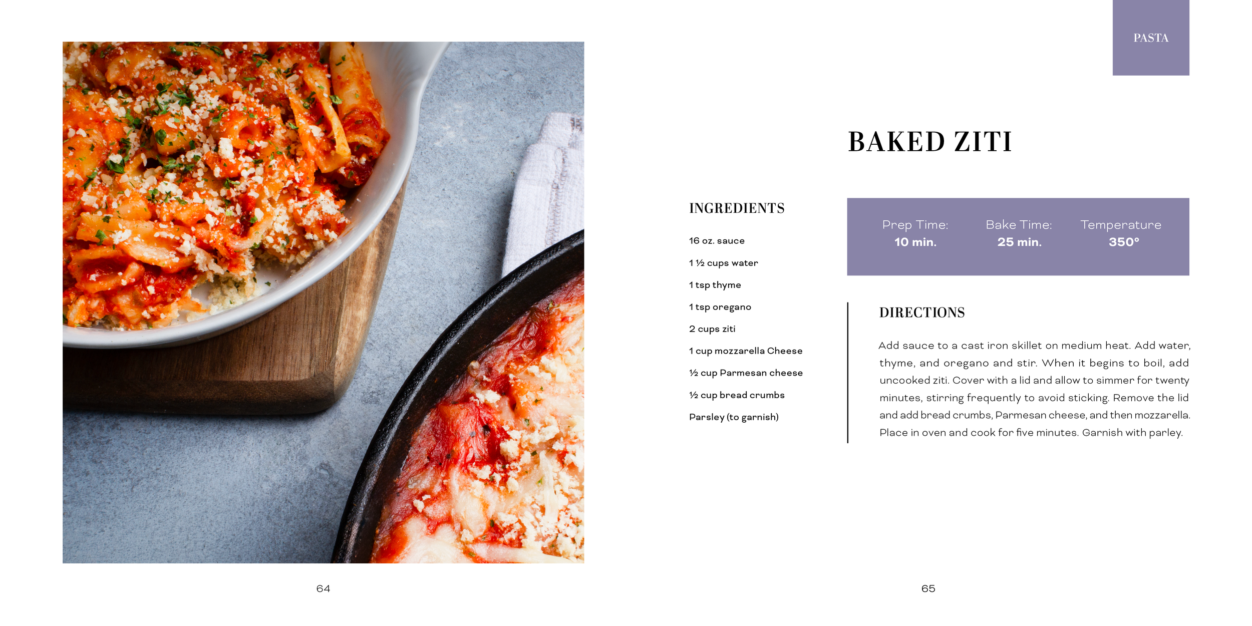
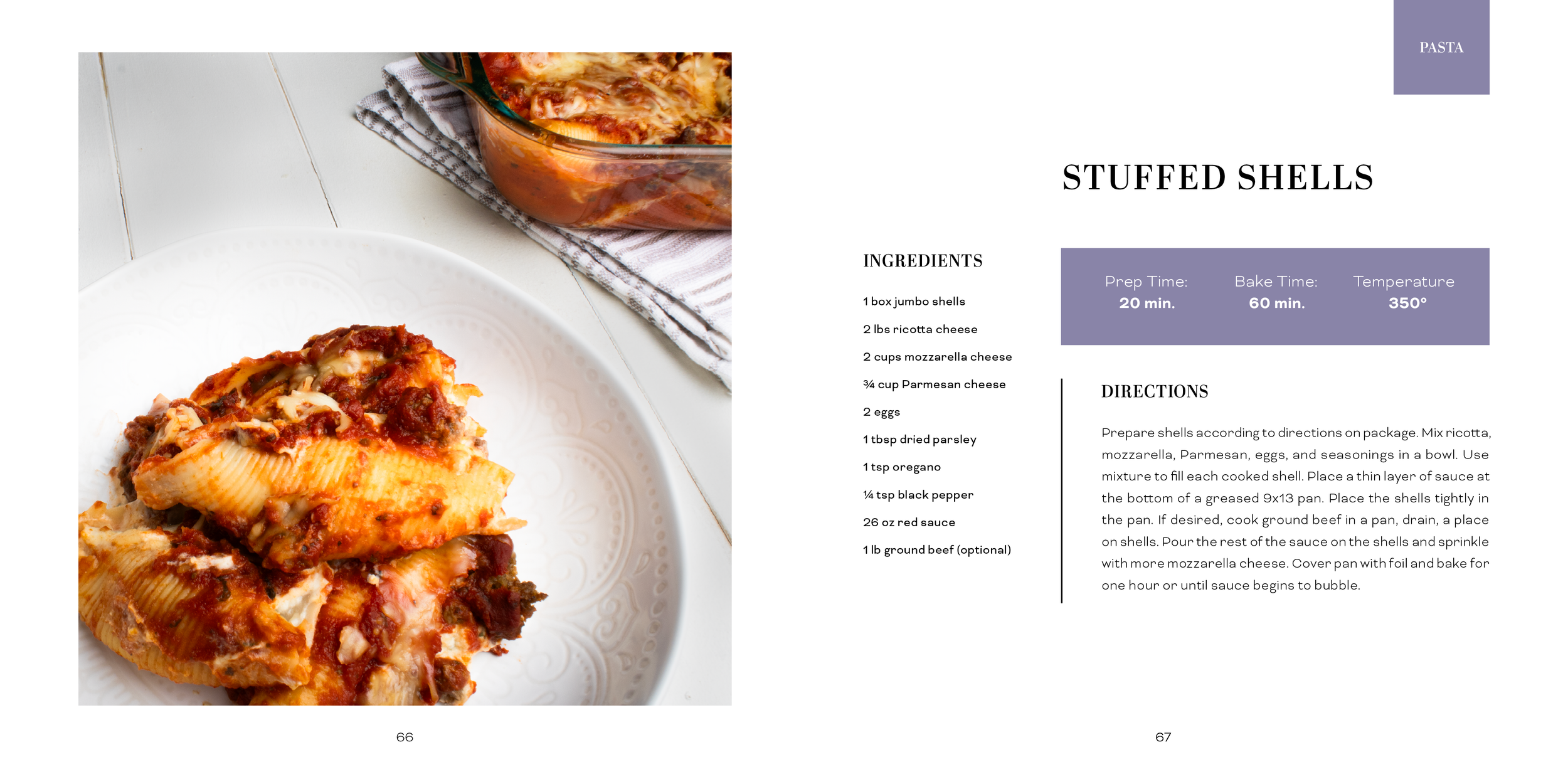
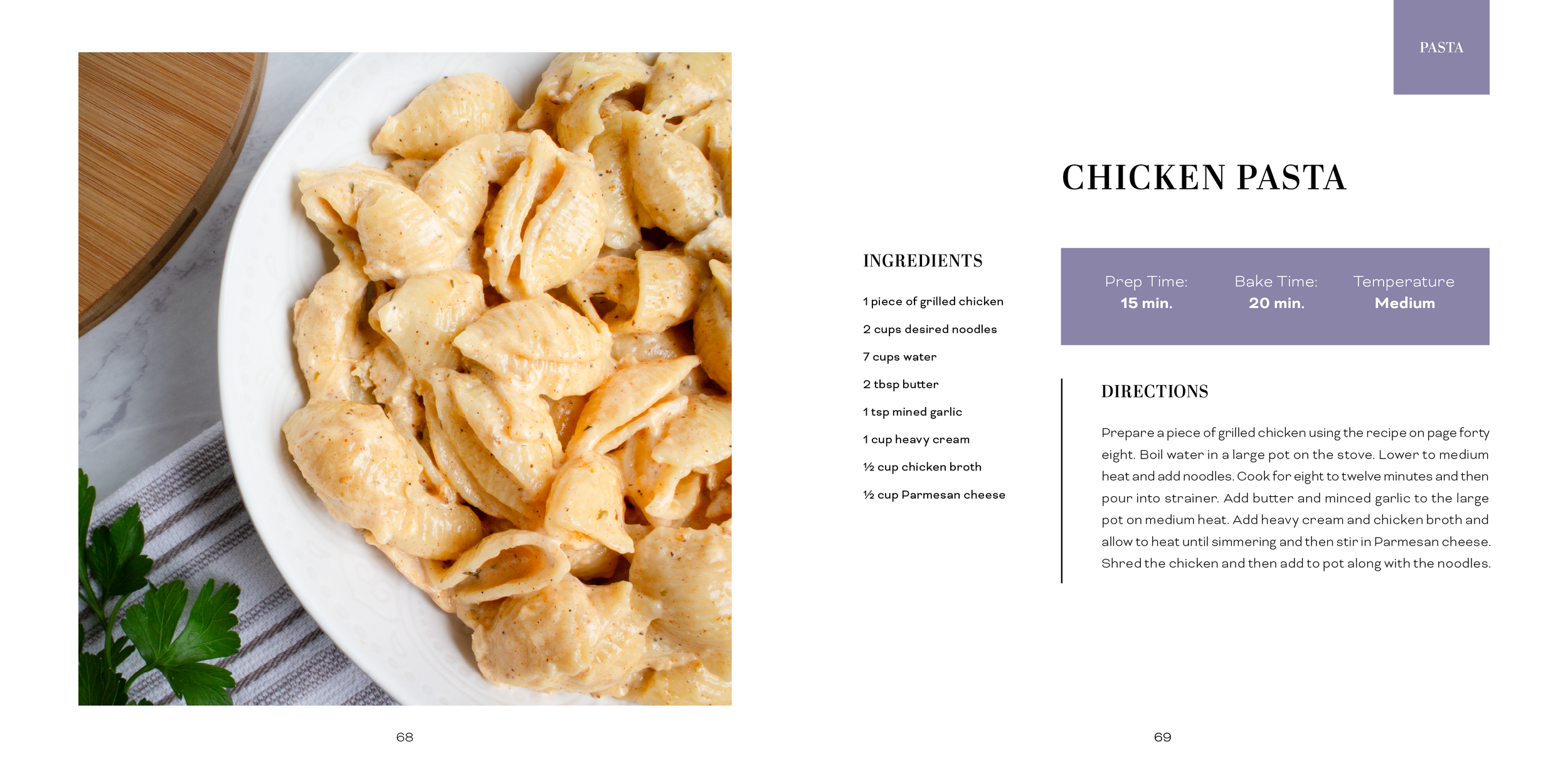
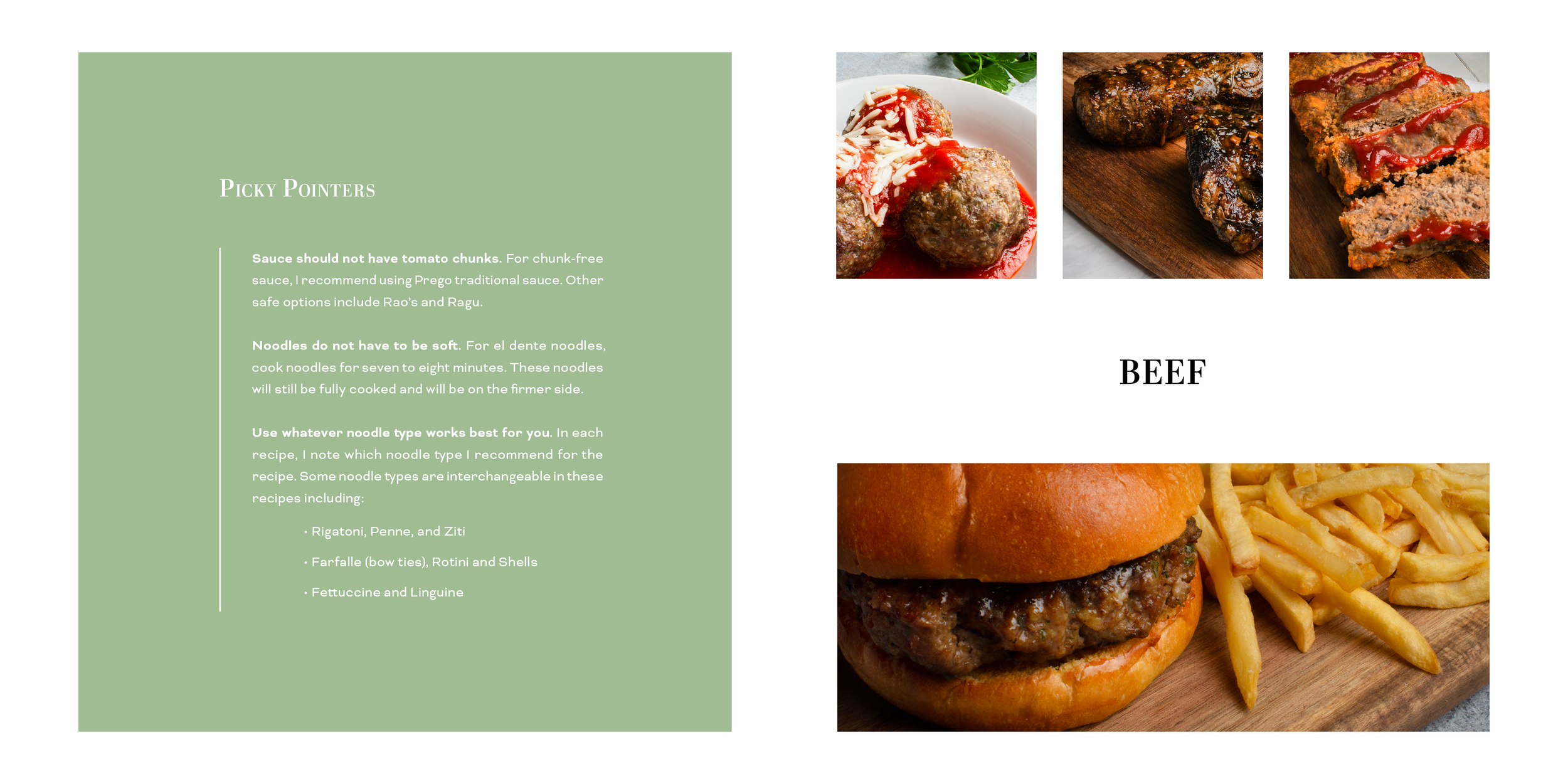
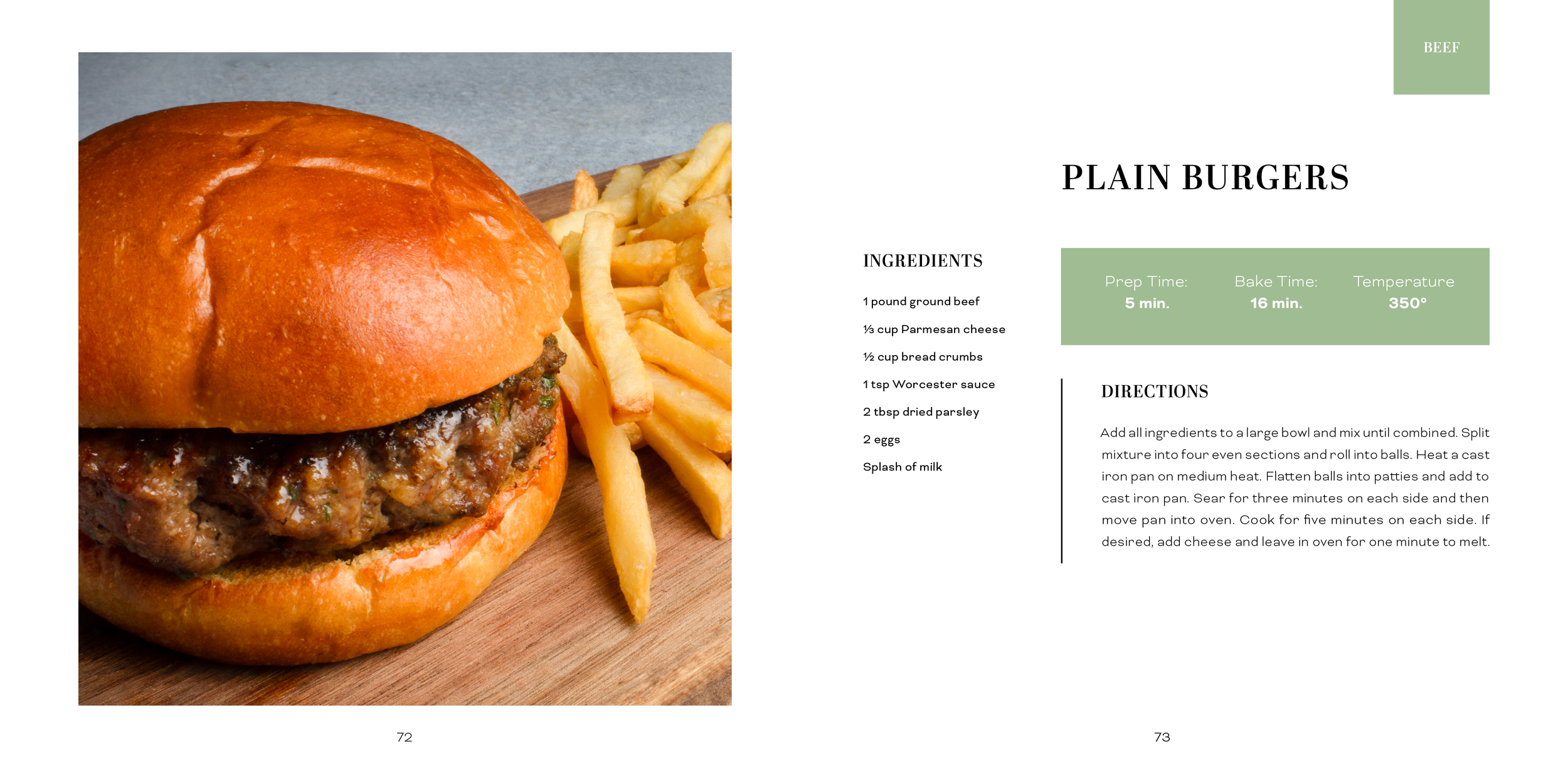
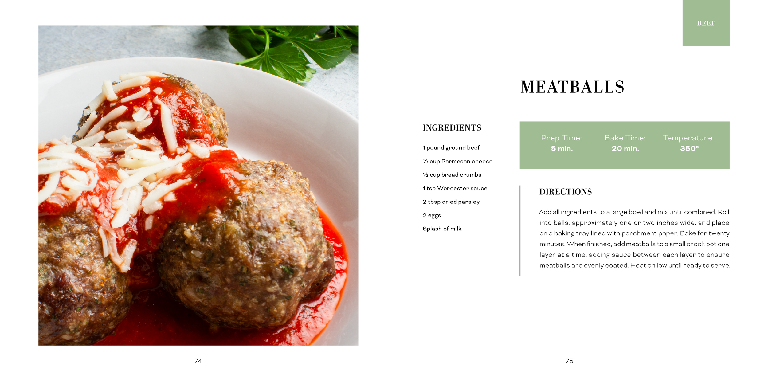
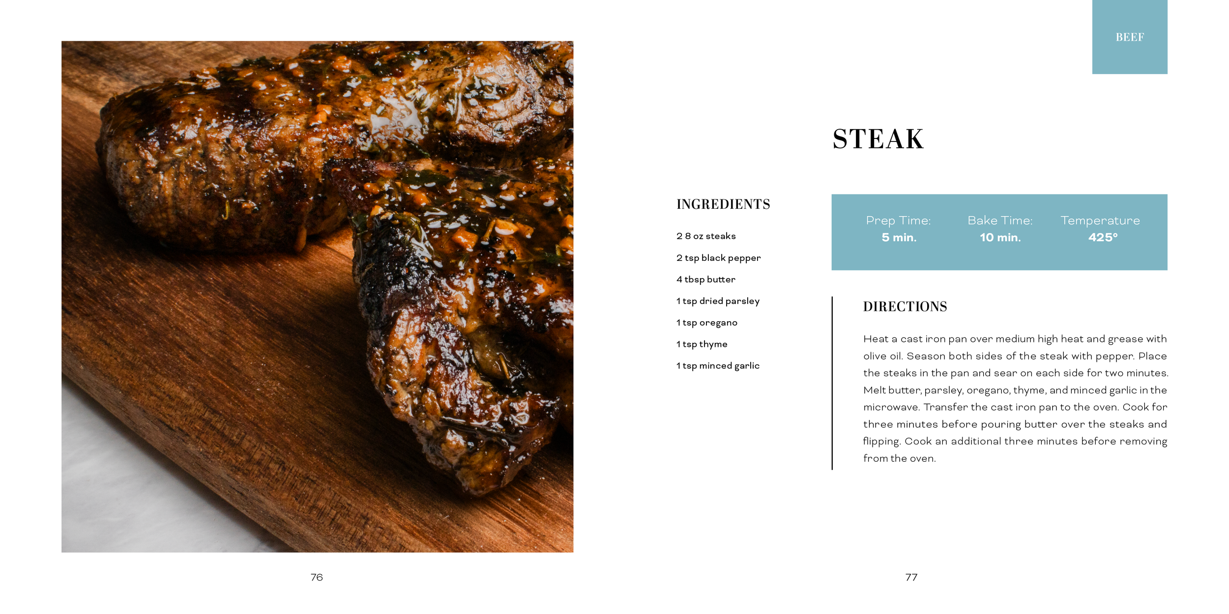
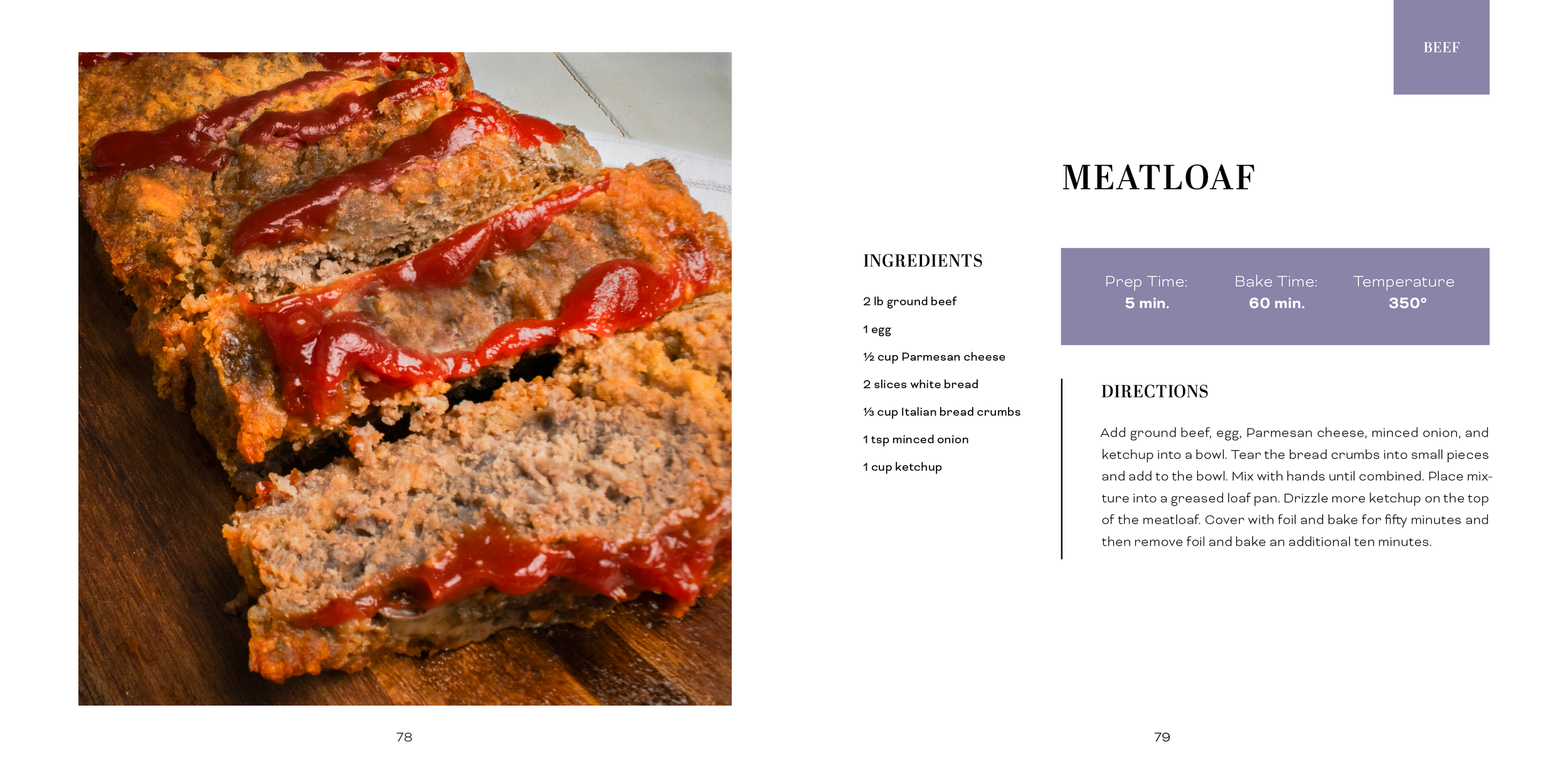
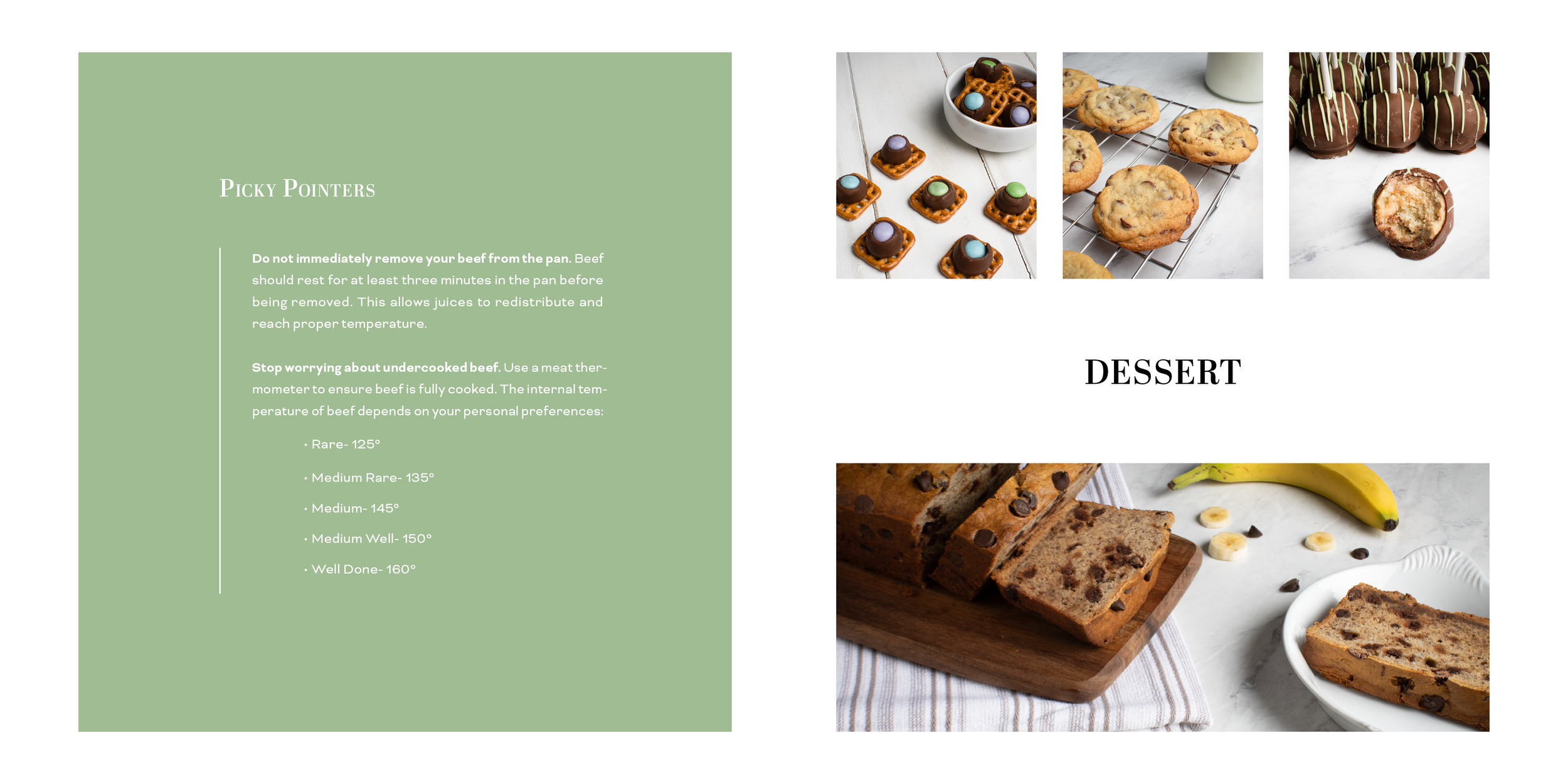
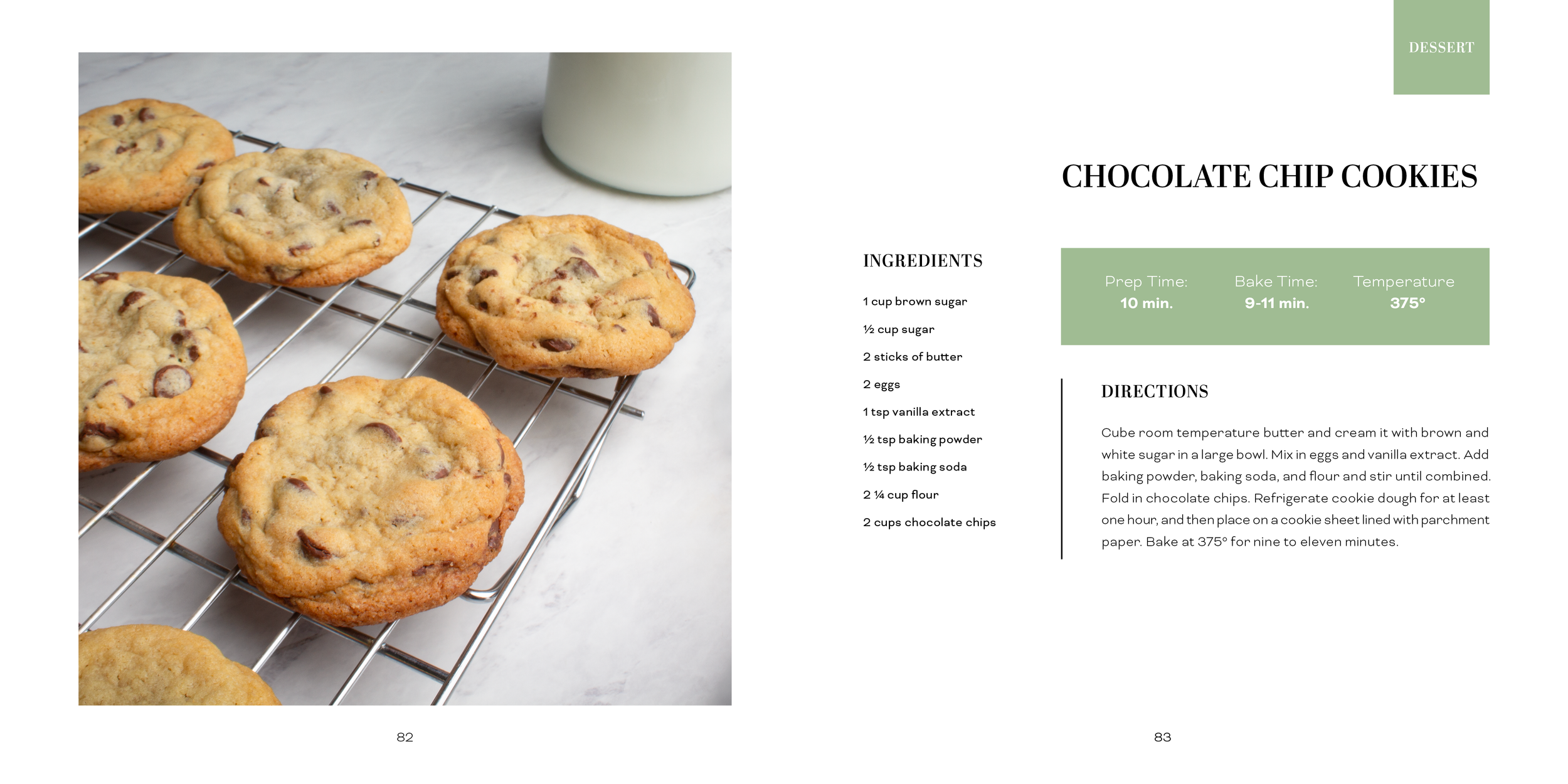
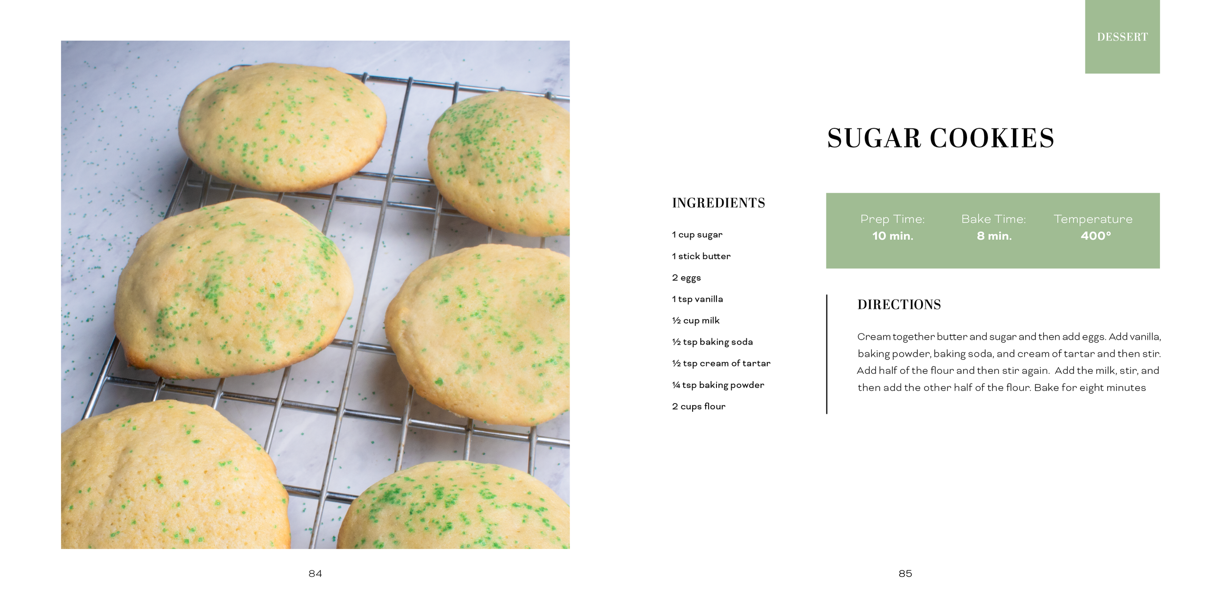
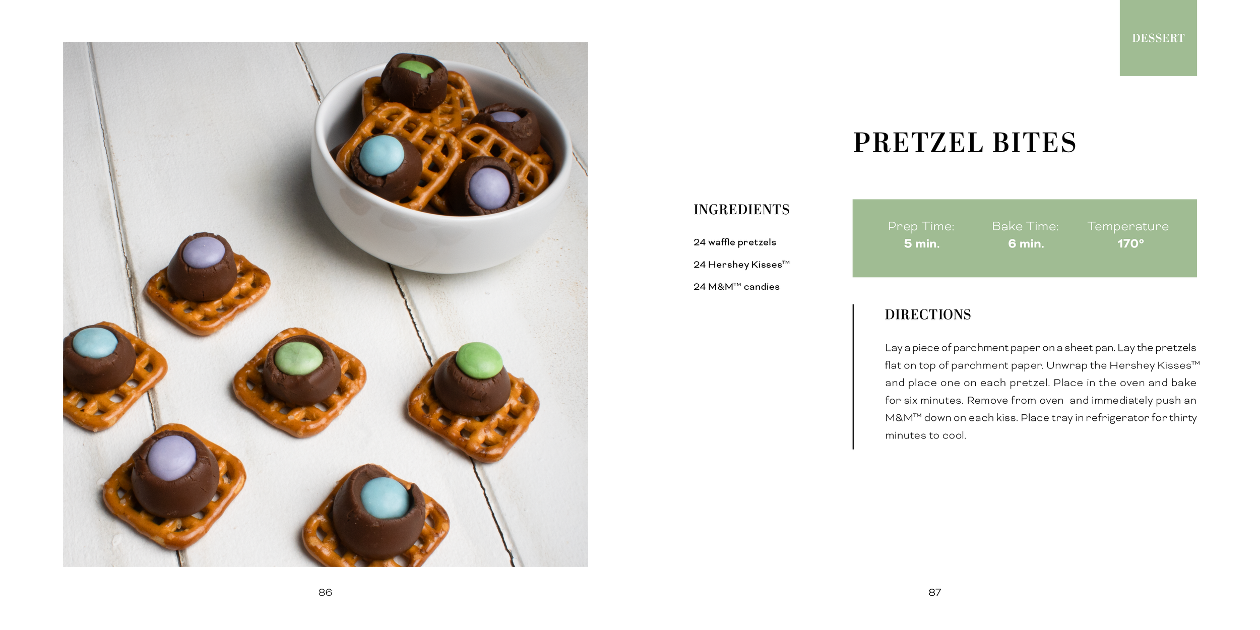
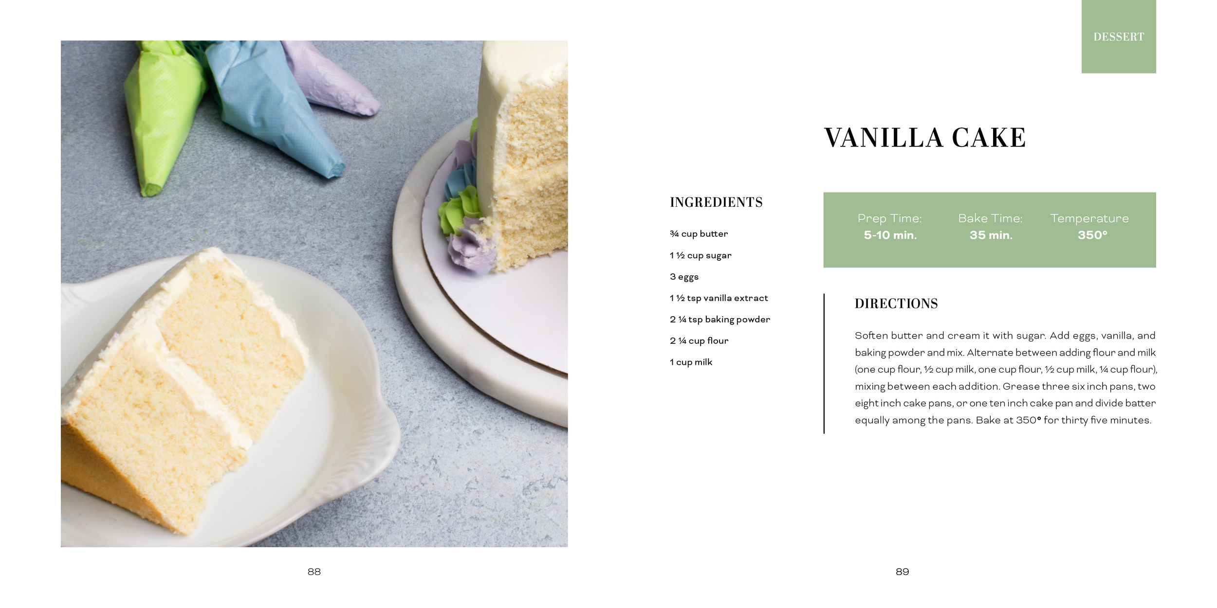
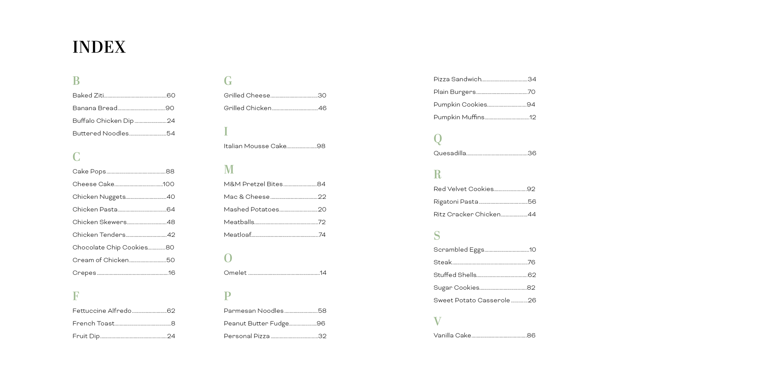
One Bite At A Time is a cook book designed for picky eaters. It focuses on helping them expand their diet and discover new foods. The recipes are divided into three categories, represented by colors. Green represents “safe” foods that picky eaters may already enjoy and are typically plain and simple. Blue represents foods that are a little more complex than the green foods, but they are still foods that picky eaters may have encountered before. Purple represents the most complex foods that picky eaters will need to build up to eating due to their complex and flavorful nature. Besides the color coded system, the book is divided into sections of food including breakfast, sides, hand-helds, chicken, pasta, beef, and desserts.
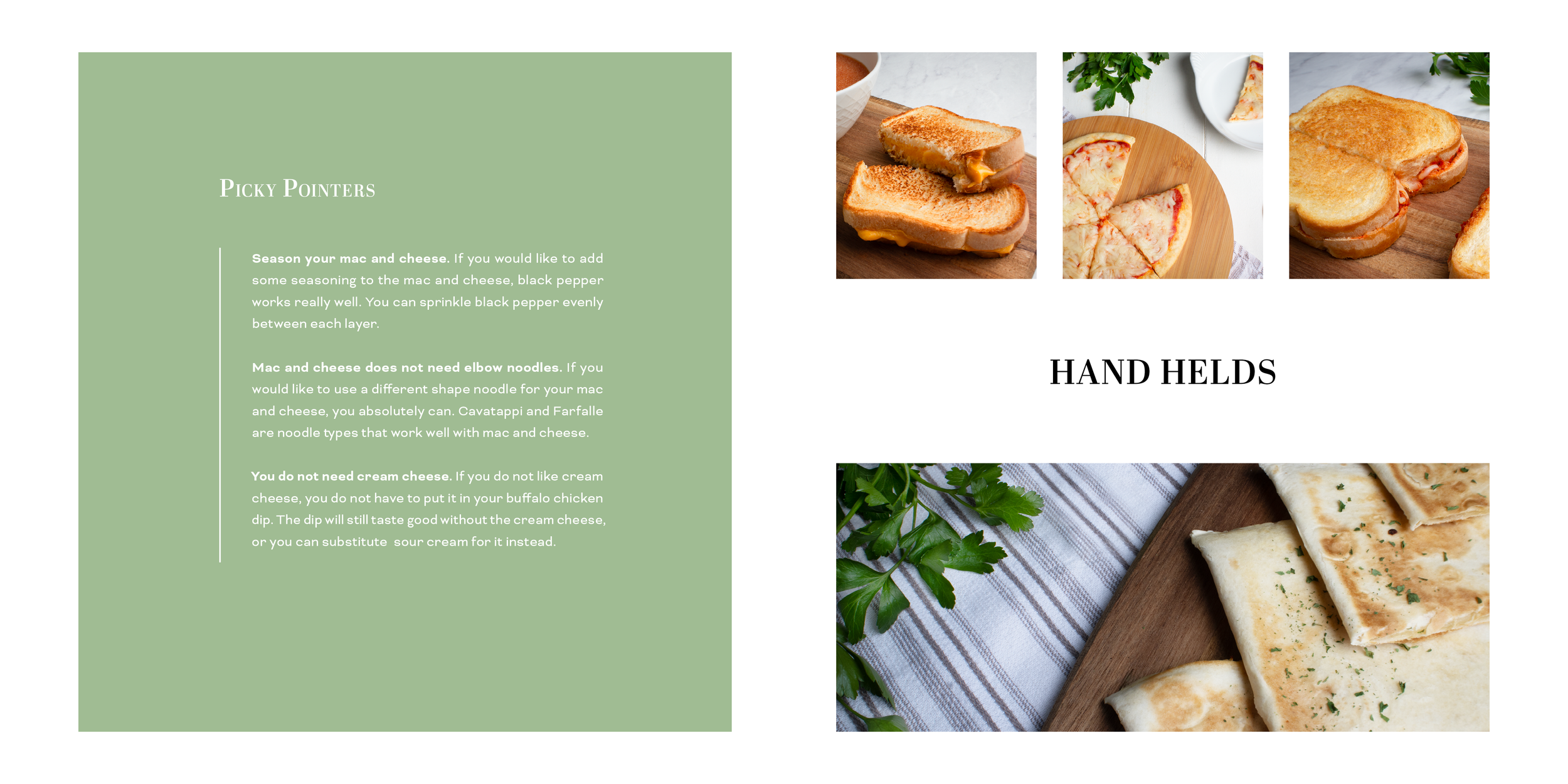
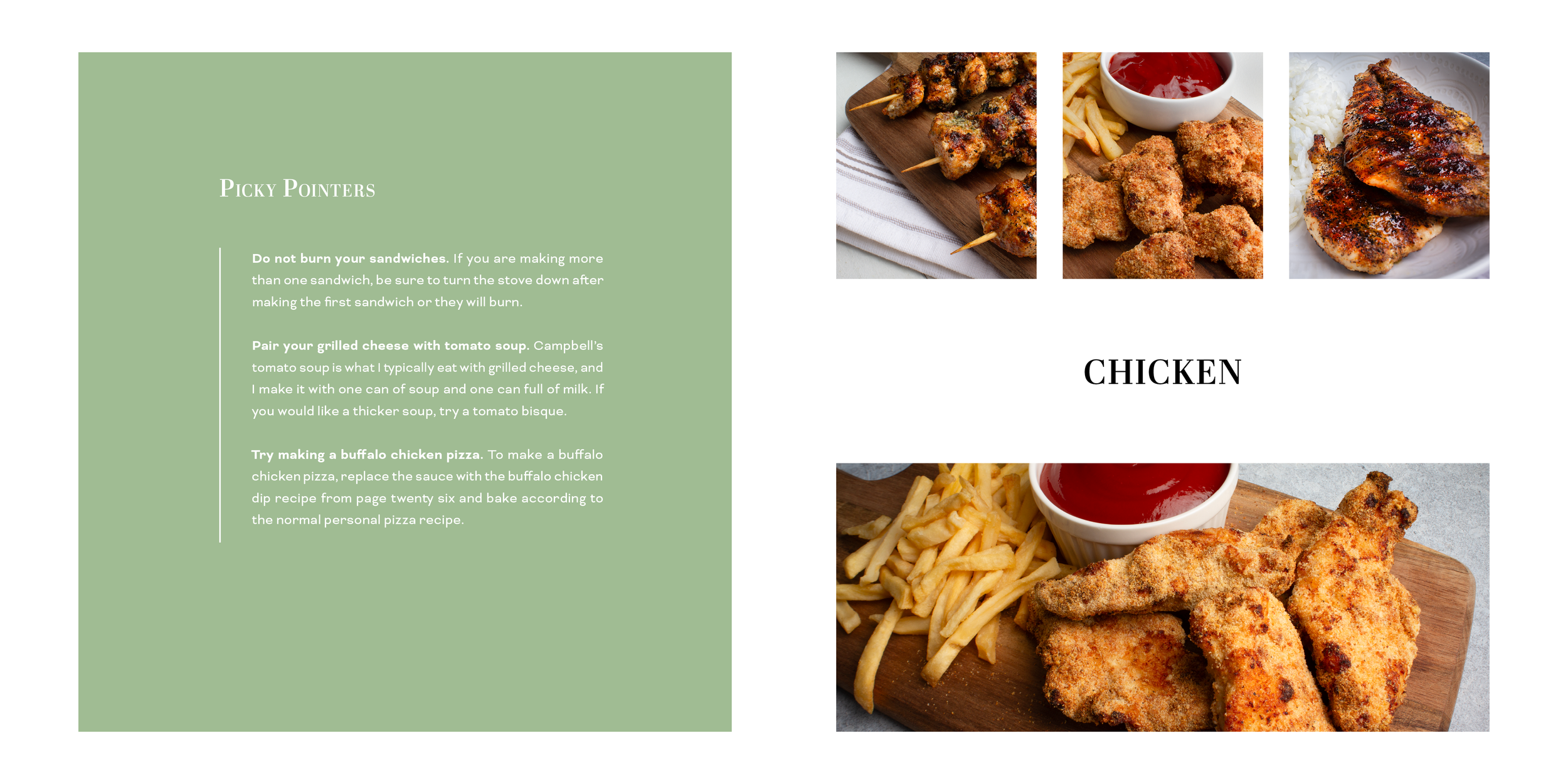
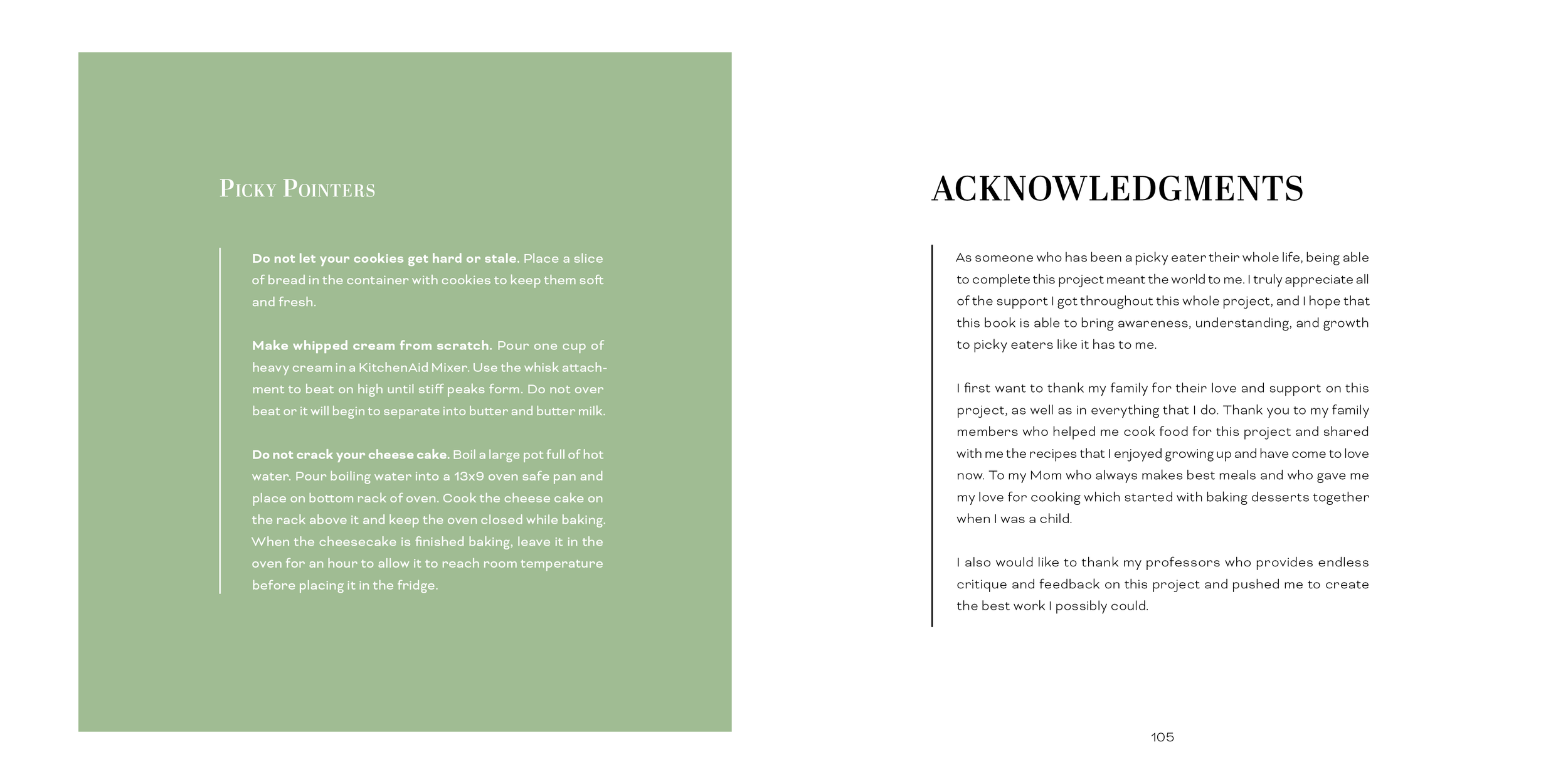
The title, “One Bite At A Time” is a play on the phrase “one step at a time,” and represents how picky eaters can take their journey with food one step at a time and at their own pace. This book is a safe space for picky eaters which is represented by the light background, cool color scheme, and understanding tone. The book also includes picky pointers that are tips for picky eaters to make recipes easier for them to enjoy. For example, picky eaters typically do not enjoy sauce that has tomato chunks in it, so one of the pointers includes brands that offer smooth tomato-free sauce. All in all, One Bite At A Time is a cook book that provides a safe reference for picky eaters to learn to cook and expand their diet.
Deliverables
1 Fully Produced Cookbook
40+ Recipes
20+ Original Photographs
Objectives
To independently research, design, and produce a cook book containing at least 40 recipes and 20 original photographs.
To apply previous knowledge of typographic layout to create a well organized page layout and cover.
To plan, design, and execute commercial photoshoots and edit them in Photoshop to produce high quality photographs with appropriate lighting.
To consider and apply self, peer, and professor critique and use it to improve design.
To have a cohesive aesthetic and style that remains consistent throughout the whole design process.
To format the cook book in an appropriate way so that it can be correctly and professionally produced.
To present the cook book in a professional and persuasive way.
Target Market
The target market of this cook book is people who are picky eaters. Specifically, picky eaters who are interested in cooking and expanding their diets. It is made for adult picky eaters, although it can also marketed toward parents with children who are picky. The average age the cook book is intended for is from 16-50 years old.
Process Narrative
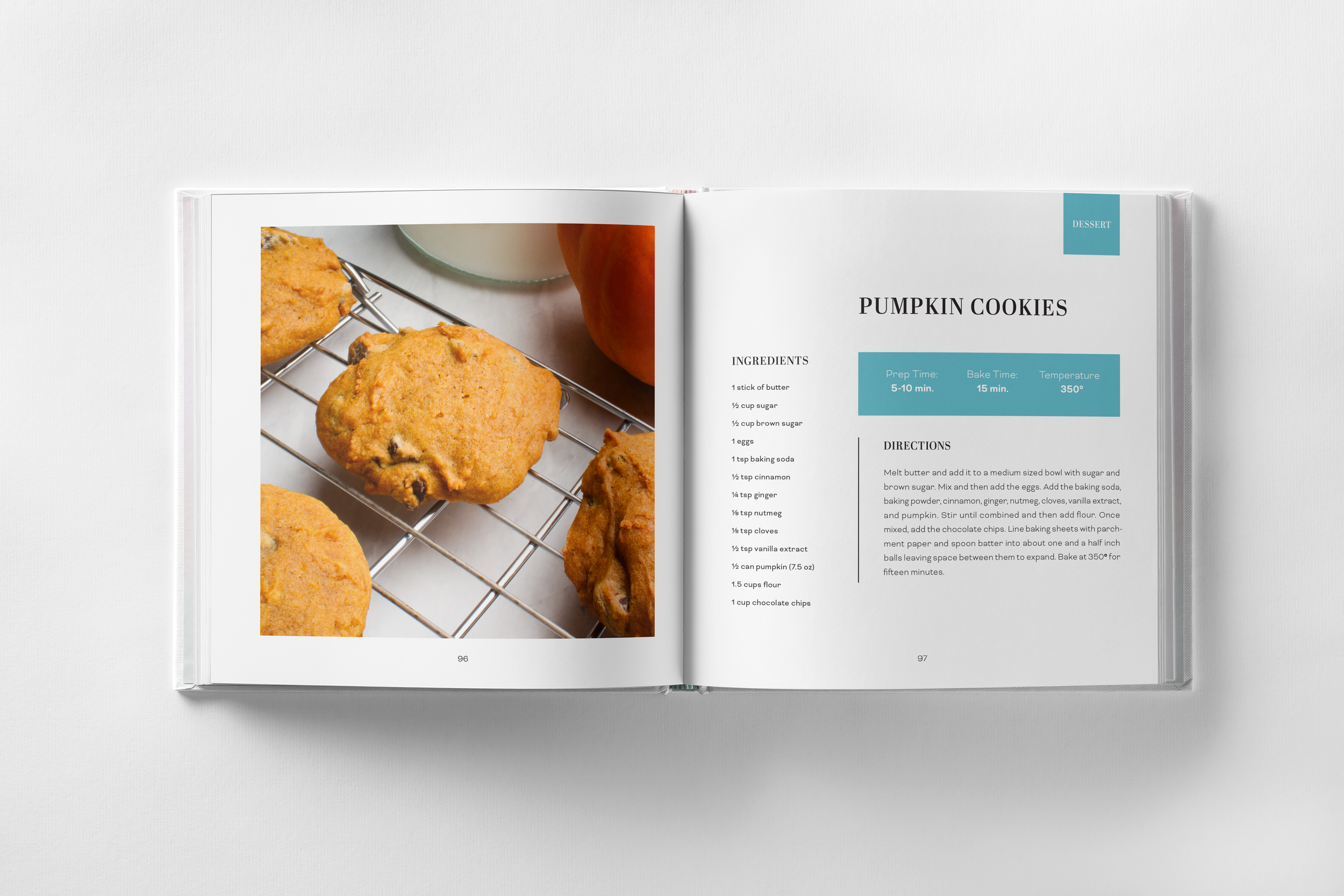
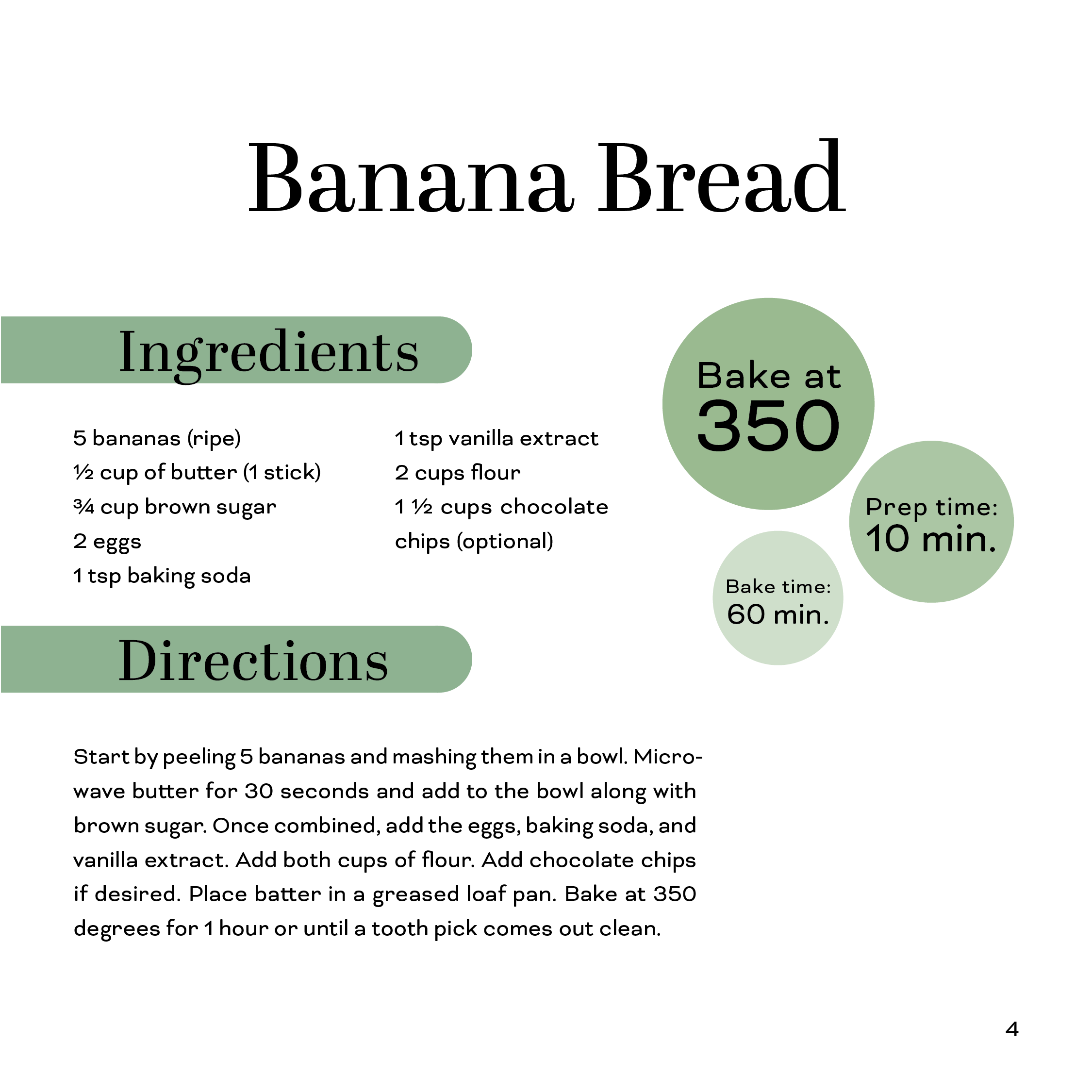
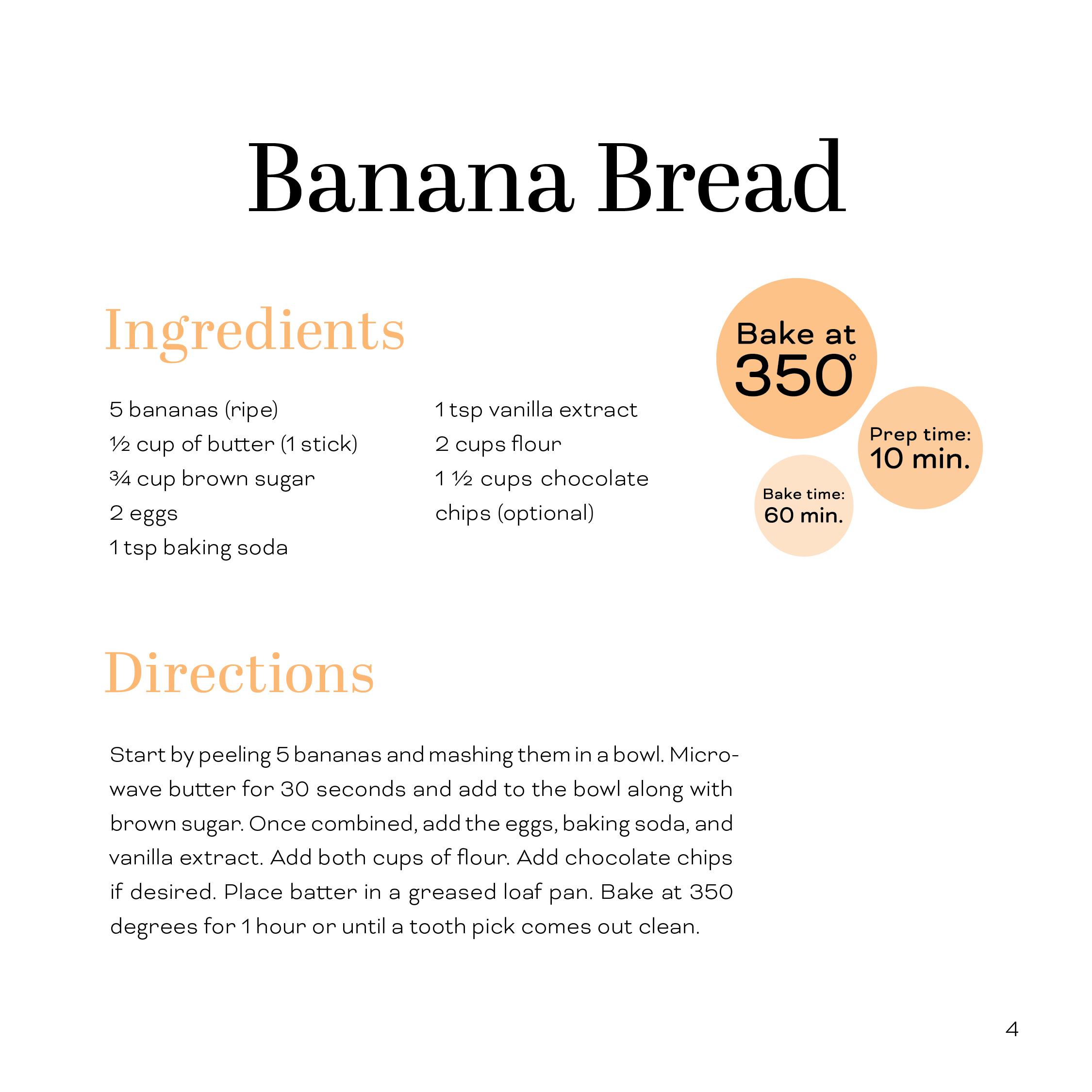
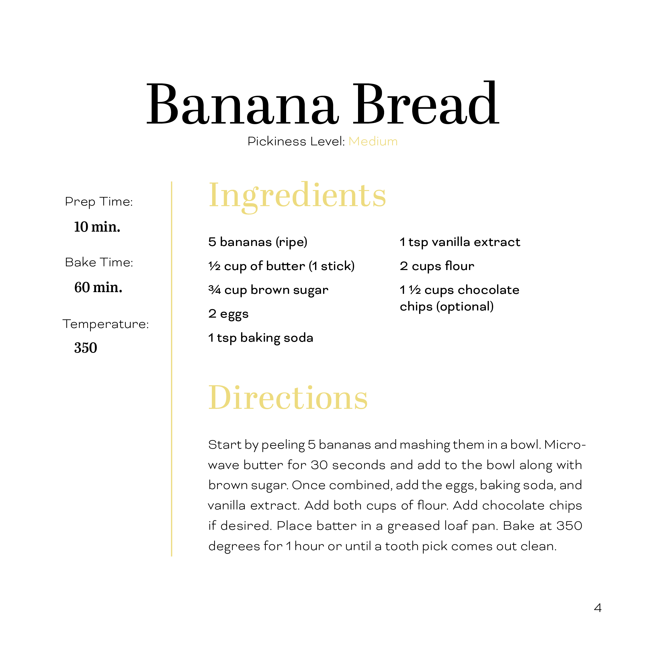
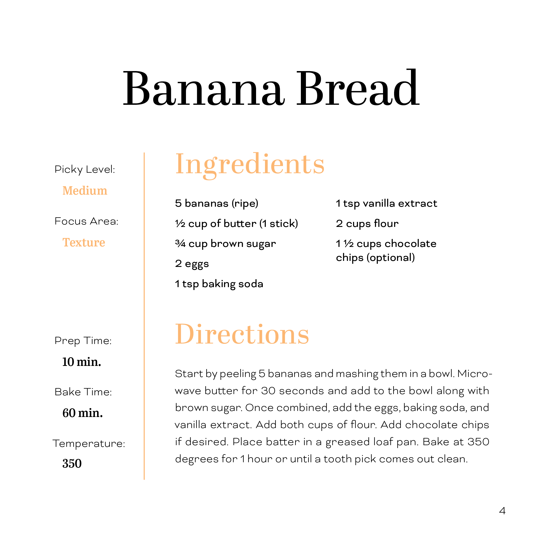
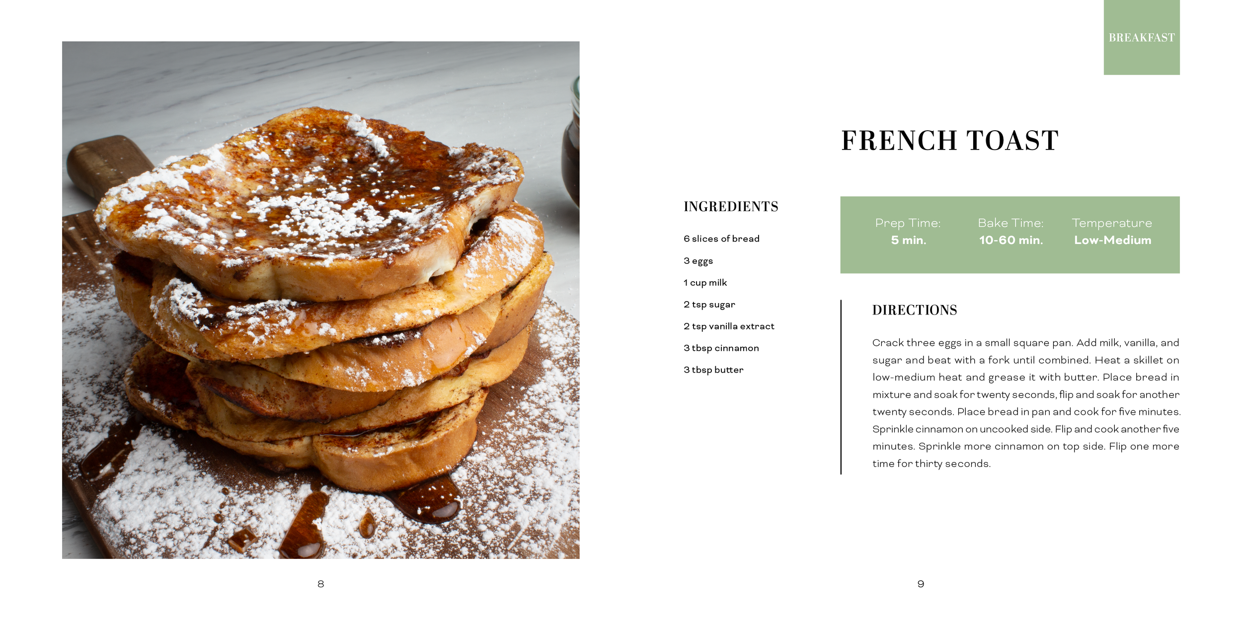
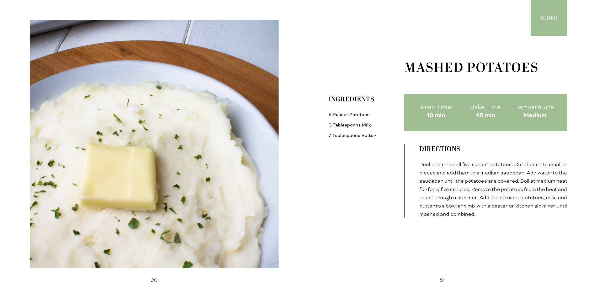
The layout for the cook book started off very plain. The original page only had the page header, the list of ingredients, and a paragraph of directions. The layout was very uninteresting and undesigned. In the next version, I began to add design elements to make the composition more exciting. I added sub-headings for ingredients and directions and circles that contained the temperature, bake time, and preparation time. I also began to integrate color into the spread. Although this version was more interesting, it was chaotic and not well organized. The bar containing the sub-headers formed an odd shape that did not fit well in the composition. On the next variation, I removed the bar and indicated the sub-headings with colored type. I also lightened the weight of the directions body type to create more hierarchy within the text. Although this version was better organized typographically, the circular elements were random and unintegrated. The design elements also did not create a well structured alignment. In the next version, I removed the circles and instead stacked the information. I also added a vertical rule to help separate and organize information. In the next version, I improved the alignment of these elements and chose to change the color scheme. Originally the pages were split between green, yellow, and orange; however, I switched to a cool color scheme and made the pages either green, blue, or purple. I also added information about the pickiness level of the recipe which helped reinforce the color code of the cook book.
Although this step of the process was well organized, it still needed improvement. In the final version of the page layout, I moved the ingredients to the left side of the page so that it could occupy one column rather than two. I then created an alignment between the header, the directions, and the rectangular figure I added to contain the baking, temperature, and preparation time information. This rectangular form allows this information to stand out more and better integrates the color in the composition. I also added a colored tab to the top right corner of the page. This helps readers identify the pickiness level of the book much quicker and find sections by quickly flipping through. I added more negative space by reducing the size of the text and headings and by removing the book title from every page and moving the section to the tab. This allowed the page number to be centered at the bottom of the page.
*Process pieces displayed in the carosel below
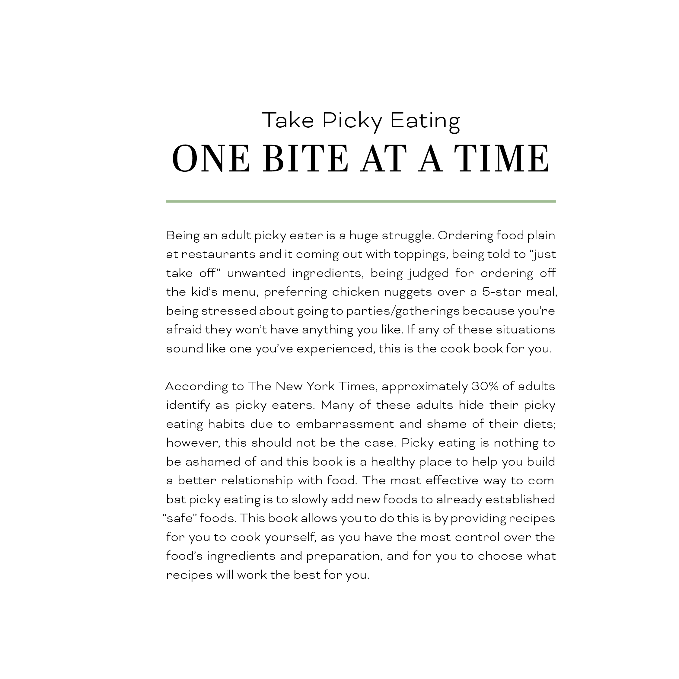
Proposal
According to The New York Times, approximately 30% of adults identify as picky eaters. Many of these adults hide their eating habits due to embarrassment and shame of their diets. The most effective way to combat picky eating is to slowly add new foods to already established “safe” foods. The best way to do this is by cooking yourself, as you have the most control over the food’s ingredients and preparation. However, digging through recipes can be challenging and it can be difficult to locate foods that accommodate a picky pallet.
This senior project objective is to create a cookbook designed for picky eaters. According to BuzzFeed and The Odyssey Online, the most avoided foods by picky eaters include mushrooms, brussel sprouts, olives, blue cheese, seafood, onions, mayonnaise, tomatoes, cottage cheese, and pickles. The cookbook will avoid these common dislikes and provide an archive of recipes for people who want to try new foods while still accommodating their tastes. My target audience for the cookbook is adults between the ages of 18 and 50 who are interested in cooking and find new recipes as a picky eater. The most effective way to expand your palette is by slowly introducing new foods. Each recipe will progress into a set of three that will feature a “safe” food that expands into two more flavorful and complex recipes. The progressions will increase by both flavor and texture.
Research Synopsis
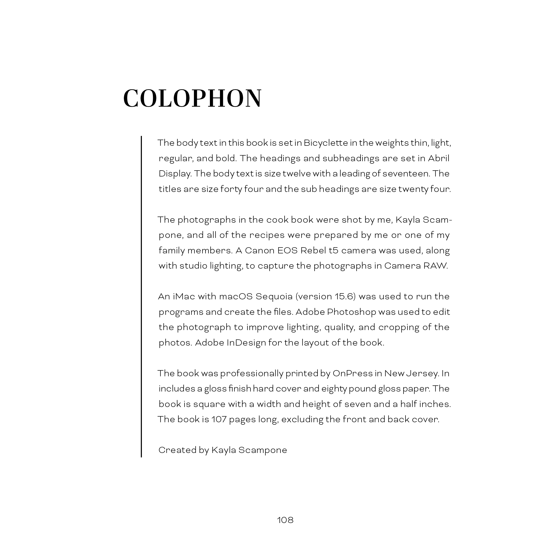
Research was a key factor for creating the One Bite At A Time cook book. The first thing I needed to research was cook book sizes to determine which size would work the best. I decided to go with a square cook book because it is modern, stands out on a shelf, is well balanced, and is easy to handle in the kitchen. I went with the size 7.5×7.5 inches because it balances legibility and convenience. It allows enough area for information and the ability to provide detailed instructions, while not occupying too much space in the kitchen.
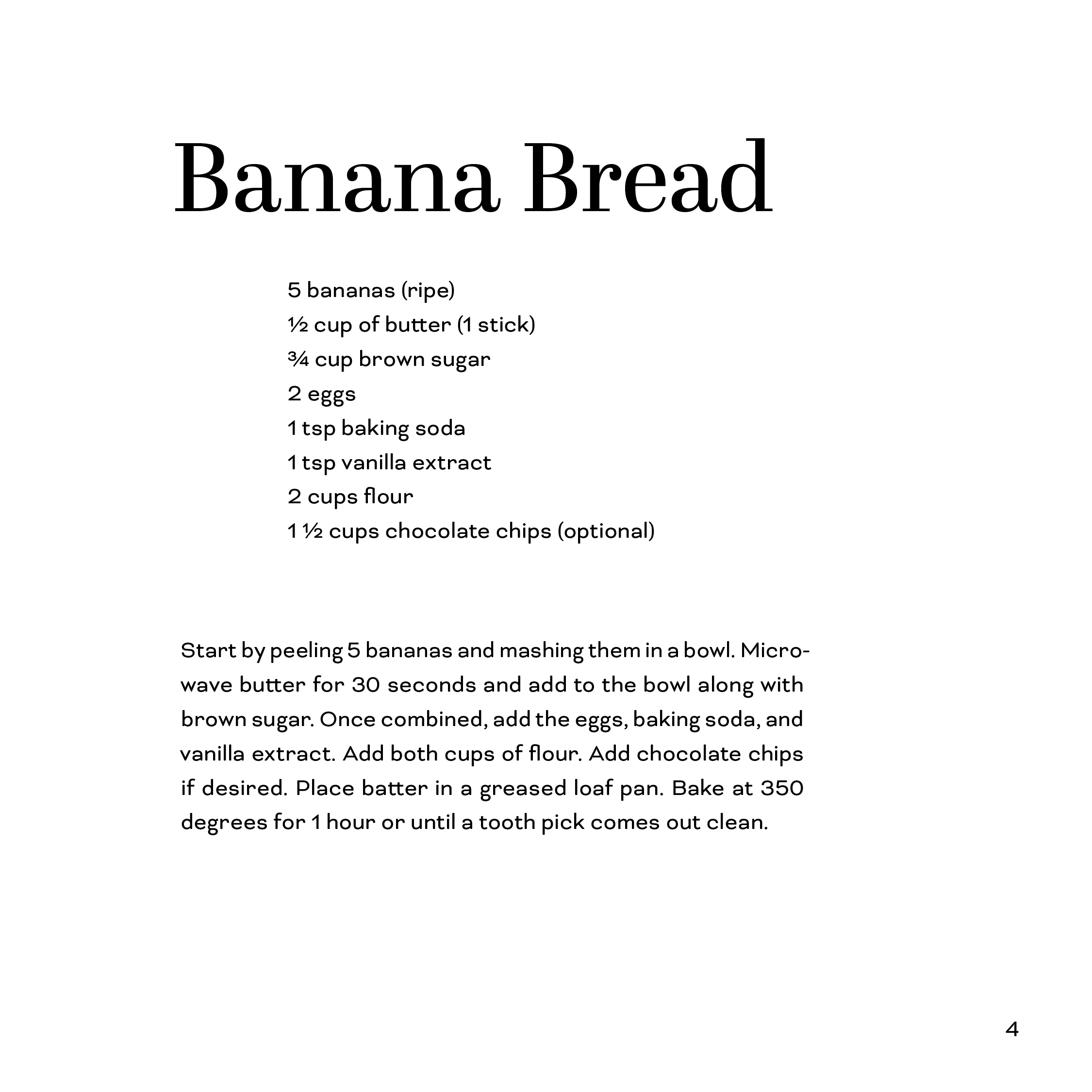
Another piece of research was gathering the recipes required for the cook book. Some of the recipes I used were family recipes that I had to get from my relatives. Many of them did not have exact recipes and measurements so I had to recreate them to obtain an accurate ingredients list for the cook book. The rest of the recipes were my own personal recipes that I have developed over the years and needed to rewrite in paragraph form for the directions section.
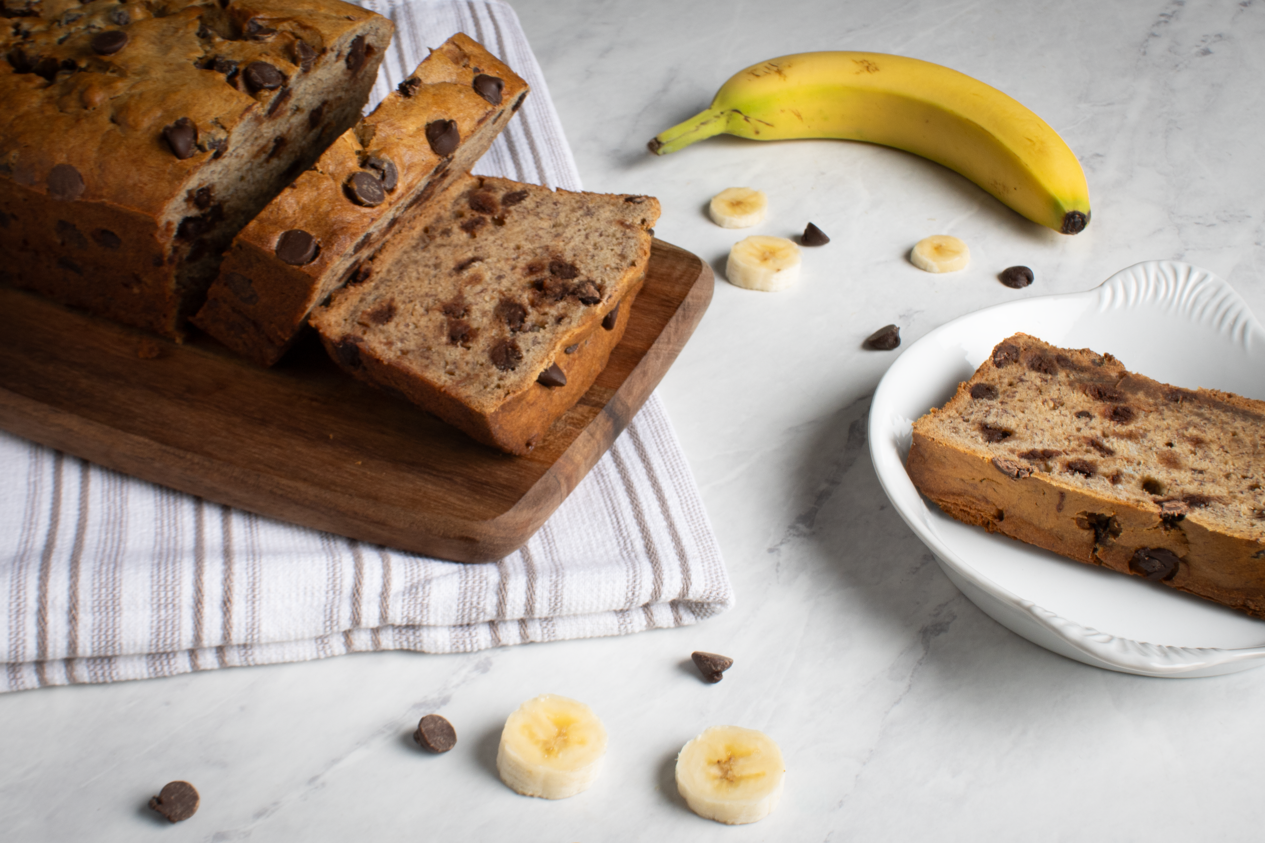
The final piece of research I did was on commercial photography. The photography needed to remain consistent throughout the entire cook book so I needed to research the ideal camera settings and lighting conditions to use for all of the food photography. Through research and testing, I found that the ideal camera settings were a shutter speed of 1/200 seconds, an ISO of 100, and an aperture between f18 and f22. For the studio lighting, I determined that using one strobe would be ideal because it would provide a shadow on one side of the food and give depth to the image.
Process 1
Process 2
Process 3
Process 4
Process 5
Process 6
Final Page Layout
Final Product
Book Production:
The One Bite At A Time cook book will be produced in two different ways, hard cover and soft cover spiral bound. The spiral bound book is nice because the spiral allows for the book to be placed flat on the counter while cooking. It also is slightly cheaper to produce. The hard cover version is sturdier but is more expensive to produce. It is also more aesthetically pleasing to look at and display. In both instances, the pages are clear coated so that light spills can easily be wiped off pages.
Additional Project Elements:
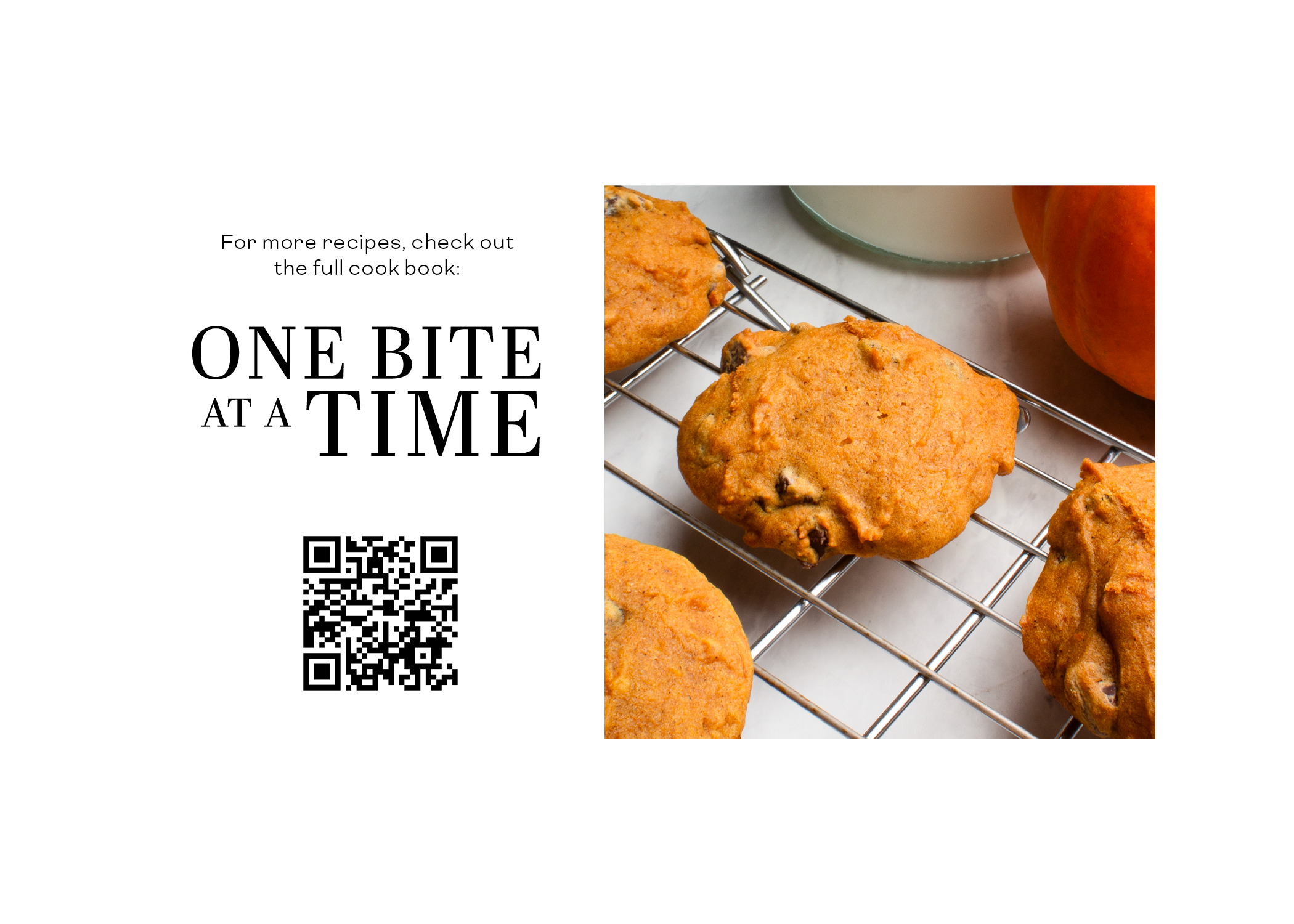
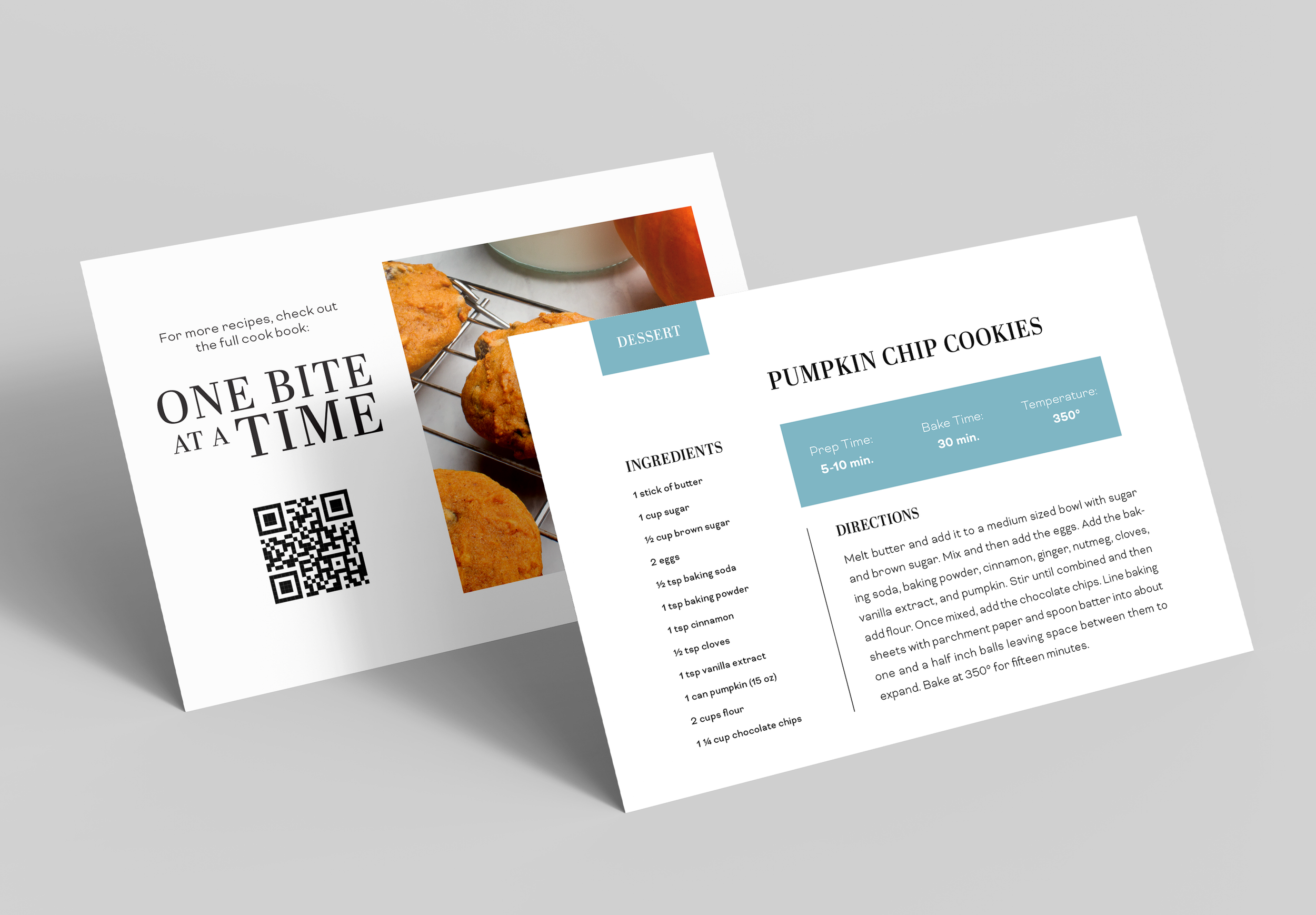
In addition to creating the One Bite At A Time cook book, I also designed recipe cards. I felt this was important because picky eaters may know they dislike a certain food group and only want to purchase certain recipes. It also would be ideal for people with dietary restrictions. For example, if someone is a vegetarian, they may not want to purchase the book due to the chicken and beef sections. Instead, they can purchase only recipes that fit their lifestyle.
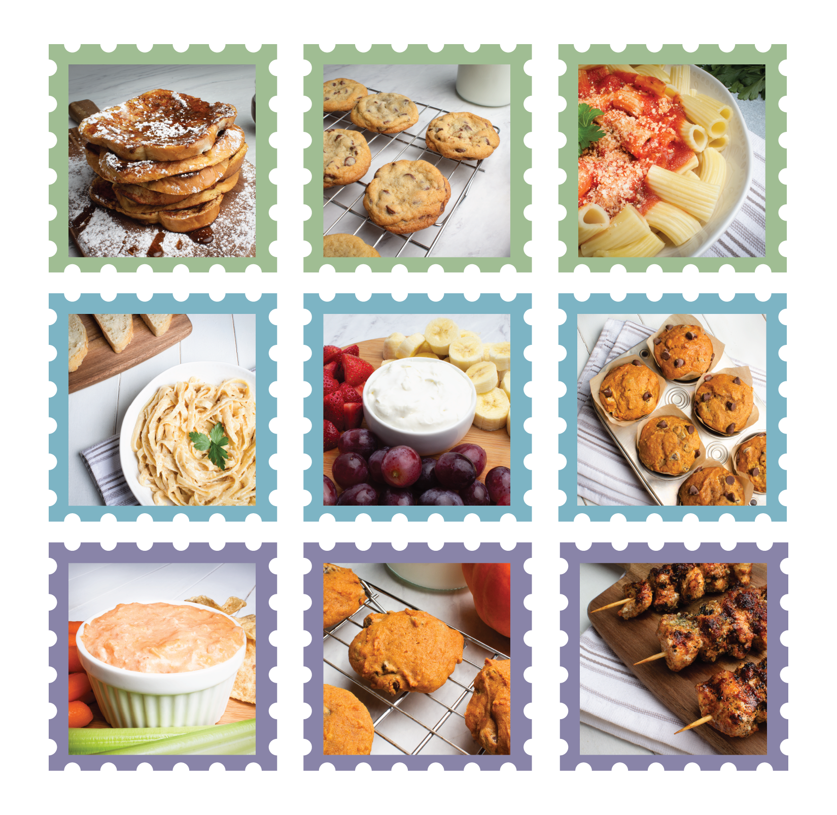
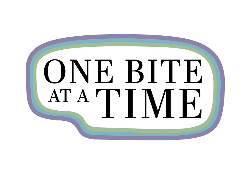
In addition to the recipe card, I also created stickers to go with the cook book. If the cook book were to be sold online, the stickers would be a good extra to put into shipping boxes. They also are good to hand out and bring awareness to the cook book. The stickers feature a food photograph from the cook book inside of a stamp that corresponds to the color that their page is in the book. The second sticker option features the type stack from the front of the book encased by three lines that represent the color scheme of the book.
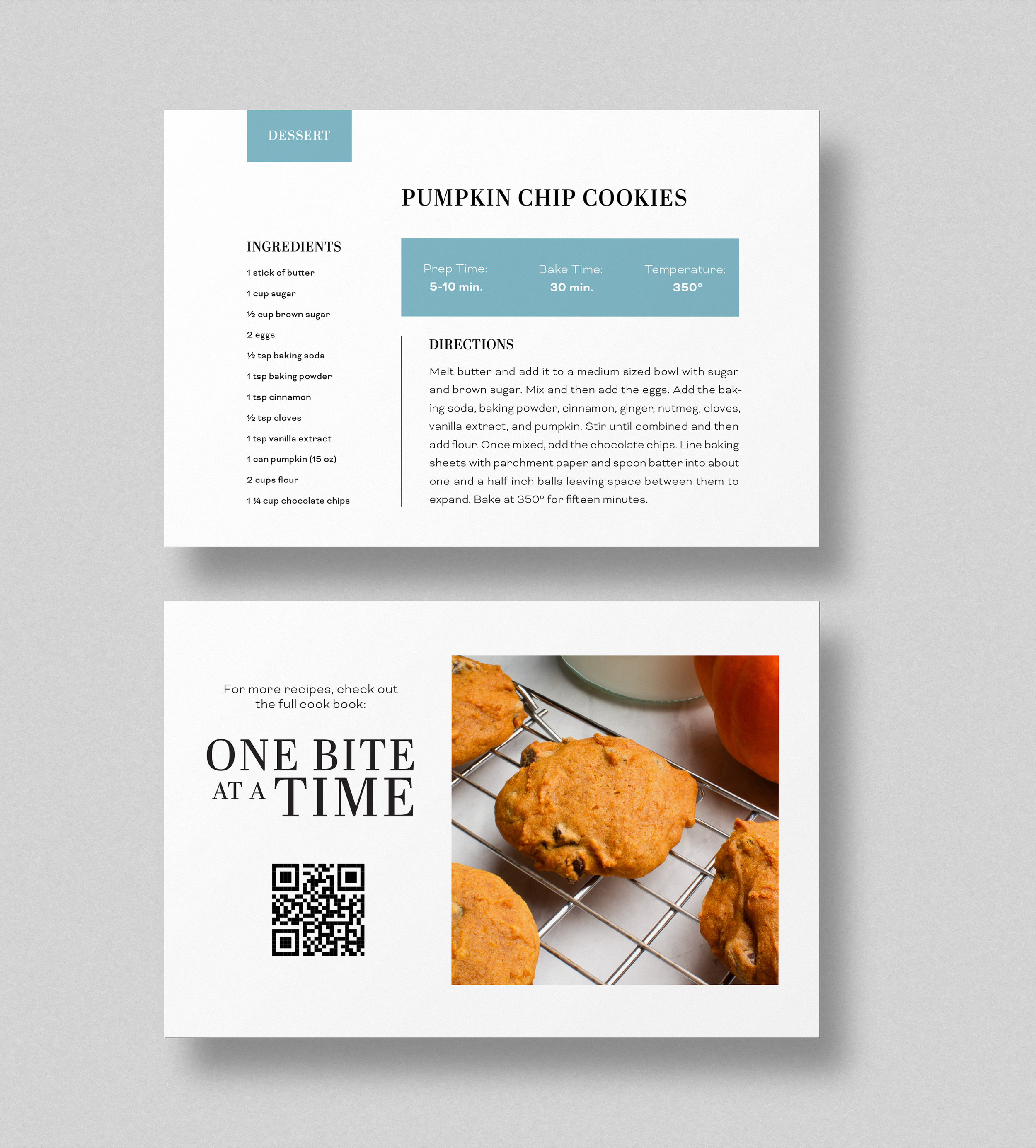
Recipe Card:

Stickers: